S
- Régence Style
- Sateen
- Sawbuck Table
- Scandinavian
- Scatter-Back Sofa
- Sconce
- Secondary Color
- Secretary (or Secrétaire)
- Secrétaire à Abattant
- Seersucker
- Segmental
- Seignorail Chair
- Self Storing Leaves
- Selvage
- Semainier
- Semi-Aniline Leather
- Semi-Attached Back
- Serpentine Front
- Settee
- Settle
- Shaker
- Sheaf-Back Chairs
- Shellac
- Sheraton
- Shield Back
- Shirring
- Shoji Screen
- Shutter
- Spindle
- Spinet Desk
- Spiral Leg
- Spiral Turning
- Sideboard
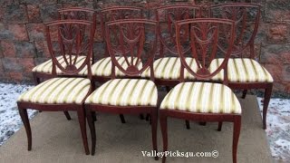
- Side Chair
- Silk
- Sinuous Springs
- Sisal
- Size (Sizing)
- Skirt
- Slant-Front Desk
- Slats
- Slat Back
- Sleeper (or Hide-A-Bed)
- Sleepy Hallow Chair
- Sleigh Bed
- Slipper Chair
- Slip Match
- Slub
- Sofa
- Sofa Table
- Soft Wood
- Southwestern
- Spade Foot
- Spandrel
- Spanish Renaissance
- Spattering
- Spiral Wave
- Spiral Welt
- Splat
- Splint Seat
- Split Leather
- Split Queen Box
- Split-Back Sofa
- Spool Bead
- Spoon Back (or Spooning)
- Springs
- Spring Down
- Squab Cushion
- Square Leg
- Staining
- Steam Bend
- Stenciling
- Stereo Cabinet
- Stickley
- Straight-Back Sofa
- Strapwork
- Stretcher
- Stripping
- Suede
- Sussex Chair
- Swag
- Swan-Neck Handle
- Swing Leg
- Swivel Chair
What is Sateen in Interior Design?
Sateen is a cotton fabric that has a smooth, silky finish on one side. It’s often used in interior design as an alternative to satin due to its affordability and durability. Its soft texture makes it perfect for use as draperies or upholstery.
What is Sateen used for?
It can also be used in bedding and pillows, giving a luxurious and elegant look. Sateen is easy to clean and maintain, making it an ideal choice for busy homes or those with children. With its classic sheen and long-lasting durability, sateen is a great option for creating timeless looks in any space.
Whether you’re using it as curtains in your living room or upholstery in your bedroom, sateen is sure to add a touch of sophistication and luxury to your home. With its versatility and affordability, sateen is a popular choice for interior designers who want to create classic looks on a budget.
What is sateen design?
Sateen design is a classic style of interior design that utilizes the smooth, silky texture of sateen fabric to create an elegant look. It incorporates elements such as drapery in rich colors and textures, upholstery with intricate details, and bedding with luxurious details. The overall goal is to create a space that looks stylish and timeless, while still being cozy and inviting. With its long-lasting durability and affordability, sateen design is an ideal choice for creating a classic look in any space. Whether you’re looking for a modern or traditional style, sateen design is the perfect fit.
What is an example of sateen?
An example of a sateen design is an upholstered headboard with rich, luxurious fabric. The headboard could be paired with soft bedding in neutral colors and metallic accents to create an elegant yet inviting look. Dark drapes or curtains could also be used in the space to add some drama, while still keeping the overall look classic and timeless. Sateen is a versatile fabric, so it can be used in any type of home to create a beautiful space that looks luxurious without breaking the bank.
What is the characteristic of sateen?
- The main characteristic of sateen is its smooth, silky finish.
- It has a slight sheen that gives it an elegant look and makes it stand out from other fabrics.
- The fabric is also durable and long-lasting, so it can be used in high-traffic areas without becoming worn or faded.
- Additionally, sateen is easy to clean and maintain, making it an ideal choice for busy households.
What is the difference between sateen and satin?
The main difference between satin and sateen design is the feel of the fabric. Satin has a smoother, more slippery texture than sateen, making it better suited for formal wear. Sateen has a slightly rougher texture with a slight sheen that gives it an elegant look. Additionally, satin is usually more expensive than sateen, making it less of an economical choice for interior design.
What other fabrics can be used with sateen?
Sateen is a versatile fabric that can be paired with many different types of materials to create unique looks.
- For example, velvet and silk are both luxurious fabrics that look beautiful when paired with sateen.
- Linen is also a great choice for drapery or upholstery, as it adds texture and light to the room.
- Finally, wool and cashmere are both ideal for creating cozy, inviting looks in any space.
Related Links
Sateen Fabric – Discount Designer Fabric
Cotton Sateen Fabric
Sateen
Sateen Solids – Joann
Cotton: Sateen – Fashion Fabrics
Related Videos


What is a Sawbuck Table in Interior Design?
A sawbuck table is a type of furniture that has an X-shaped frame, usually made of wood. It can be plain or decorated with ornate scrollwork along the edges. The design originated in the 18th century and was popular in formal settings such as dining rooms and libraries. Today, sawbuck tables are still often seen in homes, but they have also become popular in interior design due to their versatility.
What is a Sawbuck Table used for?
They can be used as side tables, coffee tables, or even consoles for a living room. Although the design is simple and often reminiscent of an antique piece, sawbuck tables are incredibly functional and easily fit into any modern decor scheme. Their X-shaped frame makes them sturdy while allowing them a certain airiness that makes them perfect for smaller spaces. With its unique shape and classic appeal, the sawbuck table is an excellent choice to bring texture and character into any interior design setting.
Antique sawbuck table
It is a timeless piece of furniture that can be used in many different settings. It adds an interesting focal point to the dining room and blends seamlessly with any decor style. The sawbuck table also provides additional storage space and can double as a sideboard, console table, or even an office desk.
Related Links
Saw Buck Table
Magnolia Home Sawbuck Dining Table By Joanna Gaines – Living Spaces
Levin Furniture
Sawbuck Table Sells For Three Times Estimated Auction Price – Entertainment – Tucson.com
Griffiths Antiques – Utica, New York – Sawbuck Table
Related Videos

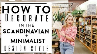
What is Scandinavian in Interior Design?
Scandinavian design is a style of interior design characterized by minimalism, functionality, and natural elements. Furniture pieces are usually simple, light, and understated but still provide a touch of elegance and sophistication. Natural materials such as wood, stone, and wool fabrics are often used to create warmth in the space while simultaneously maintaining an airy feel. Colors tend to be muted and neutral, but bright hues can be used to provide a pop of color. Lighting is important in this style, as it has the potential to create an inviting atmosphere while also providing necessary illumination. Bent plywood is a common material in Scandinavian design furniture, as it helps reduce costs without compromising on quality or aesthetics.
Scandinavian design first gained popularity in the 1930s, when it was showcased at the Stockholm Exhibition and the 1939 World’s Fair in New York. Since then, the style has become increasingly popular among interior designers and homeowners alike for its timeless elegance and versatility. As such, Scandinavian design continues to be a favorite choice for modern homes around the world.
Today, the Scandinavian design remains a hallmark of modern style and continues to be a source of inspiration for interior designers. With its emphasis on simplicity, functionality, and natural elements, it is a timeless style that can be used to create beautiful and cozy home environments. Whether you’re looking to add character to your kitchen or create an atmosphere of relaxation in your bedroom, Scandinavian design is a great choice.
In summary, Scandinavian interior design is an iconic style characterized by minimalism, functionality, and natural elements like wood and stone. It has been popular since the 1930s for its timeless elegance and versatility and continues to be an inspiration for modern home decor. With its emphasis on simplicity and comfort, Scandinavian design is a great choice for creating cozy and inviting environments.
What defines the Scandinavian style? What are the key features of Scandinavian design?
Scandinavian design is simple, practical, and uses natural elements.
Minimalist interior design
Scandinavian decor is popular and it looks neat. It has clean lines and not a lot of stuff. Bent plywood is often used to make furniture because it looks good and costs less money.
Related Links
What Is Scandinavian Design?
Scandinavian Decorating Ideas To Steal Now
Interior: Scandinavian Style On a Budget – Style At Home
64 Stunningly Scandinavian Interior Designs – Freshome.com
Scandinavian Interior Design: 10 Best Tips For Creating a Beautiful
Related Videos

What is a Scatter-Back Sofa in Interior Design?
A scatter-back sofa is a type of furniture that offers practical styling and comfortable seating. It features loose back cushions that can be rearranged to provide versatile comfort and support options for everyone in the room. The look of a scatter-back sofa is modern, but its comfort factor is timeless. Whether you are looking for a relaxed atmosphere, or a more formal look, this type of sofa can provide it. It is popular among those who want to make their home interiors stylish yet still be able to move around the cushions easily. With its ability to accommodate everyone in the room, scatter-back sofas are ideal for gatherings or just relaxing with family and friends. The overall look of the sofa is neat and organized, but it still has a cozy feel. Whether you are looking for an upgrade to your current seating arrangement or simply want to add some style to your home, scatter-back sofas make a great choice.
What is a Scatter-Back Sofa used for?
With their versatility and comfort factor, they can be used in almost any interior design setting.
What is the difference between a scatter back and a standard back sofa?
The main difference between a scatter-back sofa and a standard back sofa is the loose cushions.
- On a scatter-back sofa, the cushions are not attached to the frame of the couch and can be rearranged into different configurations. This makes it easier to customize your seating arrangement according to comfort levels or design elements.
- Standard back sofas, on the other hand, have fixed back cushions that are attached to the frame and cannot be moved. This offers limited customization options and may not be suitable for all types of seating arrangements.
- Additionally, scatter-back sofas can also create a more relaxed atmosphere than standard back sofas due to their loose cushions.
How do you style a scatter-back sofa?
When styling a scatter-back sofa, it’s important to consider the arrangement and overall look of the cushions. The more loose cushions you have, the more flexible your seating arrangement can be; however, too many cushions may create an overly cluttered look.
Pillow back sofa pros and cons
Pros:
- Pillow-back sofas offer more customization options and can be rearranged to achieve different looks.
- The loose cushions create a more relaxed atmosphere.
- They are often used in modern interior design settings.
Cons:
- The extra cushions may make the sofa appear cluttered.
- The loose cushions can be difficult to keep in place if there are a lot of people sitting on the sofa.
- It may not fit into all types of interior design styles.
- Overall, scatter-back sofas offer a flexible and comfortable seating solution for any living space.
Related Links
Orson 3 Seater Sofa, Scatterback, Chic Grey – Made.com
Scatter-back Sofa
Beautiful Home Decor, Beautifully Priced
Klaussner Jordan Large 3 Cushion Tuxedo Arm Sofa With Scatterback – Wayside Furniture – Sofas
Etienne Scatter Back Sofa Hih256684
Related Videos
What is a Sconce in Interior Design?
A sconce is a light fixture fixed on a wall that has been used in interior design for centuries. Commonly, sconces are tall and narrow, often made to hold a candle. However, modern-day sconces come in several shapes and sizes, with many types of bulbs available.
What is a Sconce used for?
They can be used as ambient lighting to create a soft, warm glow in a room, or as task lighting to provide focused light for specific activities. Because of their versatility, sconces are often used in spaces such as:
- hallways,
- stairwells,
- bathrooms and more.
When choosing a sconce for your home décor, consider the style of the room, the type of bulb, and the size of the wall space to ensure it fits perfectly. With countless options available, you can easily find the ideal sconce to bring your interior design ideas to life.
The beauty of using sconces in interior design is that they never go out of style; with proper care and upkeep, a well-chosen sconce can last for many years. Furthermore, sconces provide timeless sophistication and elegance to any room, adding character and charm with their unique designs. If you’re looking for an easy way to add warmth and ambiance to your home décor, consider adding one or more sconces to create the perfect atmosphere.
What is the purpose of sconces?
The purpose of sconces in interior design is to provide lighting in specific areas and to enhance the decor. They can be used as ambient lighting to create a soft, warm glow or as task lighting to provide focused light for specific activities. With countless options available, you can find the ideal sconce that fits perfectly into your home décor.
Why is it called a sconce?
The term sconce comes from the Middle English word “sconse”, which is derived from the Old French word “escons” meaning “candlestick”. As such, it has been used for centuries to describe a light fixture fixed on a wall. Today, sconces often refer to any type of wall-mounted lighting fixture.
Why are wall lights called sconces?
Wall lights are called sconces because the term is derived from the Middle English word “sconse”, which itself comes from Old French “escons” meaning “candlestick”.
Sidemark interior design
Sconces are a great way to add ambiance and character to any room. They can provide both ambient lighting and task lighting, allowing you to customize the look of your space. Furthermore, they can be used in almost any area, from hallways to bathrooms, making them highly versatile and aesthetically pleasing.
Related Links
Related Videos


What is a Secondary Color in Interior Design?
Secondary color in interior design is a combination of primary colors (red, blue, and yellow) mixed to create a range of other colors. The most common secondary colors used in interior design are orange, green, and violet. By blending these two sets of shades, you can add vibrant accents that create visual interest and dimension within any space. Additionally, when used together in the right combination, secondary colors can create an eye-catching and calming look that brings personality to any room.
When choosing secondary colors for interior design, it’s important to consider your overall color scheme and how the shades work together. Using complementary colors (or those directly across from one another on the color wheel) can create a balanced look while contrasting colors (those opposite each other on the color wheel) can add an eye-catching pop of contrast. Additionally, incorporating accent pieces that feature two or more secondary colors together can help tie the whole room together and make it feel more unified.
What is secondary vs primary color?
Secondary colors are derived from primary colors. A primary color is a pure color, while a secondary color is created by mixing two or more primary colors. There are three primary colors – red, yellow and blue – and three secondary colors – orange, green and violet. Each of these hues can be used to create a wide range of different shades and hues. Primary colors are often considered the foundation of any color scheme, while secondary colors are used to add more depth and visual interest.
What is the purpose of secondary colors?
The purpose of secondary colors in interior design is to add depth and visual interest to a space. By using contrasting shades, you can create a bold statement that brings life and personality into any room. Additionally, by combining complementary or analogous colors, you can create a unified look that makes the space appear more balanced and inviting.
Complementary color scheme interior design definition
A complementary color scheme is a type of interior design color palette that uses two colors directly opposite each other on the color wheel. This type of palette creates an intense visual contrast and accentuates any overlapping elements in the space. Complementary colors can be used to brighten dull areas and create a bold, eye-catching look.
The split-complementary color scheme in interior design
A split-complementary color scheme is a type of interior design color palette that uses three colors, two of which are directly opposite each other on the color wheel and one-third shade in between them. This type of palette adds visual interest by creating an even balance between light and dark hues, as well as adding a subtle hint of contrast. This type of color scheme is especially effective when used to bring life into a room or make a space appear more lively and inviting.
Tertiary colors in interior design
Tertiary colors are derived from primary and secondary colors by mixing them. These shades are created by combining adjacent hues on the color wheel, such as yellow-orange or blue-violet. Tertiary colors can be used to add subtle layers of depth and texture to any space, creating a more dynamic look that helps to bring life and personality into a room.
Related Links
Color & The Color Wheel Issaquah Schools Foundation
What Are The Three Secondary Colors?
What Are Primary, Secondary, And Tertiary Colors? – Color Psychology
Secondary Color – Teresa Bernard Oil Paintings
Primary, Secondary & Tertiary Colors – Color Psychology & Personality Meaning
What is Secrétaire à Abattant in Interior Design?
Secrétaire à Abattant is a type of writing cabinet with a fall front that rests on top of a chest of drawers or a small cupboard.
What is Secrétaire à Abattant used for?
It was widely used in the 18th and 19th centuries for its versatility and practicality, as it could be used for both storages and as a desk. The fall front opens to reveal a spacious interior with drawers and compartments, providing plenty of storage for documents, letters, books or other items. The bottom part usually consists of a small cupboard with shelves or drawers as additional storage space. Secrétaire à Abattant is an elegant addition to any home or office, offering style and functionality. Its classic design and timeless appeal make it a great choice for traditional and contemporary interiors alike. Whether used as an attractive accent piece or as a practical storage solution, Secrétaire à Abattant will surely add sophistication to any room.
Advantages of Secrétaire à Abattant
- The main advantage of using a Secrétaire à Abattant is its versatility.
- It can be used as both a writing cabinet and an attractive piece of furniture, which makes it suitable for a variety of rooms.
- The spacious interior provides plenty of storage space, allowing you to keep documents, books or other items organized and out of sight.
Disadvantages of Secrétaire à Abattant
- The main disadvantage of using a Secrétaire à Abattant is its size.
- It can take up a lot of space, especially if the bottom cupboard is large.
- Furthermore, it may be difficult to find an appropriately sized piece for smaller rooms.
- Additionally, depending on the type and quality of wood used for its construction, the writing cabinet may be quite heavy. This can make it difficult to move or rearrange in a different room.
Secrétaire à Abattant is an elegant and timeless piece of furniture that provides versatile storage solutions for any home or office. It is important to consider the size and weight of this type of writing cabinet when deciding whether or not it is suitable for your space. With careful planning, Secrétaire à Abattant can be a stylish and practical addition to any interior design.
Related Links
French Early 19th Century Napoleonic Secretaire a Abattant, Circa 1820
Drop-front secretary
Louis XVI Secrétaire a Abattant
A French Empire Secretaire a Abattant – Van Nie Antiquairs
What is a Secretary (or Secrétaire) in Interior Design?
It is a drop-leaf desk with drawers, slots, and cubbyholes used to store papers and other essentials. Traditionally crafted of wood, modern Secretary desks may be made from a variety of materials such as metal, glass, or plastic. They are often seen in offices due to their space-saving design and ability to provide ample workspace when open, yet remain compact when closed. The height of the writing surface is typically below standard desk heights to provide better posture while seated. Secretary desks offer the perfect combination of style and functionality, making them a popular choice for any home or office.
In addition to being practical, Secretary desks also serve as attractive pieces of furniture in interior design settings. They come in a variety of styles from traditional to modern, allowing you to choose the perfect design for your home or office. With its sleek lines and simple construction, a Secretary desk can be a stylish addition to any room. The combination of drawers, slots and cubbyholes provide ample space for storing documents, supplies, and other items while also creating an interesting, visually appealing aesthetic.
Whether you need more workspace or just want to add a beautiful piece of furniture to your home, a Secretary desk is a perfect choice. Its space-saving design and variety of styles make it a great option for any interior design setting. With its practicality and stunning design, a Secretary desk is the perfect piece of furniture to complete any room.
Why is furniture called a secretary?
The term ‘secretary’ comes from the French word secrétaire, which means “one who is entrusted with secrets”. In the 18th century, a secretary desk was used to store important documents and papers and to keep them away from prying eyes.
What is a secretary used for?
A secretary desk is a versatile and functional piece of furniture that can be used for a variety of purposes. It is typically used to store documents, supplies and other items, but it can also serve as an elegant workspace. The combination of drawers, slots, and cubbyholes allows you to organize your items in an aesthetically pleasing way.
What is a secretary cabinet?
A secretary cabinet is a type of drop-leaf desk with drawers and compartments for storage. The design of the cabinet is typically slimmer and more compact than other desks to make it easier to store, but it still offers plenty of storage space. Secretary cabinets are often seen in offices due to their efficient use of space, but they can also be used in home settings.
What is a secretary’s bookcase?
A secretary bookcase is a type of drop-leaf desk that combines the storage of a cabinet with the display space of a bookshelf. It typically has drawers and compartments for papers, documents, supplies, and other items, as well as shelves to store and display books or decorative items. The design of a secretary bookcase allows you to maximize space in any room while creating a stylish look.
Related Links
The Essential Guide To The Secretary Desk — One Kings Lane
Secretary Desk – World Market
Trumble Secretary Desk with Hutch
Secretary Style Computer Desk – Ideas On Foter
Secretary Desks
Related Videos
What is Seersucker in Interior Design?
Seersucker has long been a staple fabric in traditional interior design. Its lightweight texture and crisp, striped pattern make for an airy yet eye-catching addition to any room. Seersucker’s puckered surface gives it a unique texture which adds visual interest and depth to a space.
What is Seersucker used for?
It is ideal for use on bedding, curtains, and upholstery as it adds a cheerful splash of color to any room. Seersucker is also an excellent choice for draperies and blinds due to its airiness and classic style. Whether used to brighten up a living room or add a touch of traditional charm to the bedroom, seersucker is sure to make any space feel inviting and cozy. With its timeless look and lightweight texture, seersucker is a great choice for adding a touch of personality to any room.
The versatility of seersucker means it can be used in most interior design styles from classic to modern. Its subtle pattern lends itself well to traditional looks while its bright colors can be used to add a dash of playfulness to contemporary designs. Seersucker is also easy to incorporate into everyday décor, like throw pillows or duvet covers, and can be used in any room of the house.
Benefits of Seersucker
- Seersucker offers many benefits when it comes to interior design.
- Its lightweight texture makes it easy to move and changes the look of a room quickly.
- Its classic pattern also makes it timeless, meaning you won’t have to worry about it going out of style anytime soon.
- Finally, seersucker is an affordable option that comes in a variety of colors and patterns so you can find something to suit your needs without breaking the bank.
What is the description of a seersucker?
Seersucker is a special kind of fabric. It is usually made with cotton but it can also be made with other materials. It has bumps on the surface and stripes that make it look different than other fabrics. People like to use seersucker in their homes because it looks nice and adds a bit of personality to the room.
What are the characteristics of a seersucker?
Seersucker is a lightweight fabric that has a unique texture.
- Its uneven weave gives the fabric its signature puckered surface and striped pattern.
- It is typically made of cotton, but can also be found in polyester or other synthetic fibers.
- Seersucker’s airy texture makes it ideal for use on bedding, curtains, upholstery, and draperies.
- It is also easy to incorporate into everyday décor, like throw pillows or duvet covers.
- Seersucker offers a classic look with a touch of personality that can be used in any interior design style from traditional to modern.
What material is seersucker?
Seersucker is typically made of cotton, but can also be found in polyester or other synthetic fibers.
What color is seersucker?
Seersucker is available in a variety of colors, from classic neutrals to bold hues. It’s subtle striped pattern lends itself well to traditional looks, while its bright colors can be used to add a dash of playfulness to contemporary designs. No matter what color you choose, seersucker will bring life and personality into any room.
Related Links
Seersucker
9 Seersucker Facts – Things You Didn’T Know About Seersucker Fabric
Seersucker: What It Is, Why You Need It & How To Wear It – Fashionbeans
Men’s Seersucker Suits – New Orleans Original Seersucker – Haspel
Seersucker Fabric – Seersucker Fabric By The Yard
Related Videos


What is Segmental in Interior Design?
Segmental pediments are a type of architectural element commonly used in interior design. This type of pediment has an irregular, less than semi-circular shape with an abrupt ending curve.
What are Segmental pediments used for?
Segmental pediments are often used to create interesting visual interest and can be found on furniture pieces, window frames, and doorways. While segmental pediments are typically used to create visual appeal, they can also be used as practical design elements. For example, segmental pediments can be used to cover unappealing architectural features or to add depth and dimension to a space. Segmental pediments have been popular throughout the centuries, from ancient Greek architecture to modern interior design trends. When used effectively, segmental pediments can add a unique touch to any room.
Related Links
Segmental Pediment – Article About Segmental Pediment By The Free Dictionary
Round Pediment
Ancient Greeks And Romans Broke Their Pediments – Alberti’s Window
The Architectural Pediment And How To Use It
Pediment
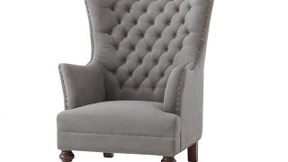
What is a Seignorail Chair in Interior Design?
Seignorail chairs are ornate, high-back armchairs that sit at the head of a room.
What is a Seignorail Chair used for?
They were traditionally used as seating for the master of a house and are associated with luxury, power, and authority. These chairs have an imposing presence that is often complemented by their intricate details such as carved woodwork or upholstered arms and backrests. Seignorail chairs also often feature intricate designs, such as elaborate scrolls or cresting on the top of their backs, which add to their overall grandeur. These chairs are perfect for creating an elegant atmosphere in any room and are timeless pieces of furniture that will remain stylish for years to come. Whether you’re looking to add a touch of sophistication to your living room or want to make a statement in a formal dining space, Seignorail chairs are a perfect choice. With their timeless beauty and impressive stature, these chairs will bring an air of opulence to any room.
Advantages of a Seignorail Chair
- A Seignorail Chair is a great choice for any room that needs to be both beautiful and stately.
- Seignorail chairs are extremely durable and can stand up to regular use without losing their charm.
- They also have an impressive presence that commands attention and respect, making them ideal for formal dining areas or living rooms.
- Furthermore, these chairs are incredibly versatile and can be adapted to any decor style, from classic to modern.
- Finally, Seignorail chairs come in a variety of materials, so you can find one that fits your budget as well as your aesthetic preferences.
Disadvantages of a Seignorail Chair
- Seignorail chairs can be quite expensive due to their intricate designs and quality materials.
- They also tend to be bulky and may not fit into smaller spaces.
- Furthermore, these chairs are typically more fragile than other types of furniture and need to be handled with care.
- Finally, the upholstery on Seignorail chairs can be difficult to clean and may require special care.
Related Links
Seigneurial Chair – Furniture City History
Seignorial Chair Images, Stock Photos & Vectors – Shutterstock
Seignorial Chair, France – Mia
Seignorial Chair Stock Photos & Seignorial Chair Stock Images – Alamy
Chair – Encyclopedia
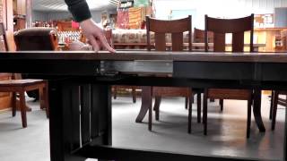
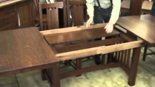
What are Self Storing Leaves in Interior Design?
Self Storing Leaves are an innovative and versatile design feature that can be used to maximize space in the home. This furniture feature is essentially a table with built-in leaves that can be extended when needed but stored away within the main structure of the table so it doesn’t take up extra space. This type of furniture works especially well in areas where space is limited, such as dining rooms or small apartments. Self-storing leaves are a great way to add functionality and style to any interior design without sacrificing space. Not only do they provide extra seating when needed, but they also offer a modern, clean look to the space. Furthermore, self-storing leaves can be easily folded away for storage when not in use, so you can keep your home looking neat and organized. Whether you’re looking for extra seating or just a stylish way to maximize space, self-storing leaves are an excellent choice for any interior design project.
How do you store table leaves yourself?
Storing table leaves yourself is a simple process. When not in use, the leaves can be folded away so they fit neatly within the main structure of the table. This ensures that your space stays organized while still allowing you to extend the table when needed. To store the leaves, simply find the hinges on the side and push them together until they click into place. This will keep the leaves securely stored away, ready to be used whenever you need them. Alternatively, some tables come with drawers that can be used to store the leaves when not in use.
Should table leaves be stored flat or upright?
While it is possible to store table leaves in both flat or upright positions, it is recommended that they always be stored flat. This is because when the tables are stored upright, there is an increased chance of them becoming damaged over time due to shifting during travel or storage. Additionally, storing the leaves flat ensures that they will not warp from humidity or temperature fluctuations. For this reason, it is best to store the leaves flat whenever possible.
Self storing table leaf mechanism
Self-storing table leaves are typically operated by a mechanism that is built into the table. This includes hinges and other hardware that hold the leaves in place when extended or stored away. The exact mechanism will depend on the type of table you have, but typically it consists of two main components – hinges and extensions. The hinges attach to the sides of the table and support the weight of the leaves when extended, while the extensions are what allows for the leaves to be folded away. This type of mechanism is designed to be easy to use and can provide a great way to maximize space in any interior design project.
Wood dining table design with self-storing leaves
Wood dining tables with self-storing leaves are a great way to add both style and functionality to any interior design project. These tables often feature a classic design that compliments other pieces of furniture, while still providing the practicality of having additional seating when needed. Furthermore, the self-storing leaves allow for the table to be extended without taking up extra space, making it a great choice for those with limited room. By combining style and function, wood dining tables with self-storing leaves can be a great addition to any home.
Related Links
How Does Self Storing Leaves In My Table Work? – Amish Direct Furniture
Self Storing Amish Table Leaves – Countryside Amish Furniture
Self Storing Leaves Dining Tables – Houzz
Convenience Self-Storing Leaves
Self-Storing Leaves: Beautiful Tables That Store Their Leaves For You – Home And Timber
Related Videos

What is Selvage in Interior Design?
Selvage is an interior design term used to describe the finished sides of a lengthwise grain that prevents travel.
What is Selvage used for?
This type of fabric or material can be used for various applications such as upholstery, curtains, and trim. Selvage helps create a neat look in any room. It also helps protect against fraying and unraveling, which increases the lifespan of the fabric or material. Selvage is available in a variety of colors, textures, and styles to match any design aesthetic. Whether you are looking for something classic and timeless or more modern and contemporary, selvage can be a great addition to your project. With its impressive durability and finish, it is no wonder why selvage is a popular choice for many interior design projects.
What are some advantages of using Selvage?
Selvage offers superior durability when compared to other types of fabric or materials, making it ideal for projects that require long-term wear and tear. It is also resistant to fading, staining, and abrasion. Additionally, because of its finished edges, the fabric can’t unravel or fray, which increases its longevity.
Home decorating inspiration
Selvage is a fabric that can be used in many different places. It looks nice and will last for a long time. Selvage can make any room look beautiful, whether it is classic or modern. Use selvage for upholstery, window treatments, and more!
Conclusion
Selvage is a type of fabric used for making curtains, upholstery, and trim. It is strong and can come in many colors. It helps stop the fabric from unraveling so it lasts a long time. People use Selvage in their homes to make them look nice.
Related Links
Selvage
Selvage – Definition Of Selvage By Merriam-Webster
What is a Selvage?
Selvage – Wiktionary
Sewing Tips: Selvage / Bias / Grain Definition – How To Cut a Fabric Edge
Related Videos


What is Semainier in Interior Design?
Semainier is a tall, narrow chest with seven drawers.
What is Semainier used for?
A commode is a type of furniture with drawers. It looks nice and can make any room look better. It gets its name from the French word “week” because each drawer was thought to be big enough to hold items for one week. You can put it in a bedroom, living room, or hallway.
Today, Semainier chests are often seen as lingerie chests and are used to store delicate items such as undergarments, jewelry, and accessories. They can also be used to store clothing or linens that need to be kept out of sight. Additionally, the top surface of a Semainier chest makes it convenient for use as a desk by simply placing a chair in front of it. With its versatile design, the Semainier is a great addition to any interior space.
What is Semainier made from?
Semainier chests are usually made from wood and can have different kinds of decoration on the outside like laminates and shiny finishes. They come in all sizes and styles for everyone’s tastes. Some Semainier chests have drawers with carvings or bevels on them, while others have drawers with special knobs made of crystal, ceramic, or glass. No matter what kind you get, it will look nice in any room at home and provide storage.
How many drawers does a semainier have?
A semainier chest has seven drawers.
Conclusion
In summary, Semainier is a tall, narrow seven-drawer chest with a stylish design. It is often used to store delicate items such as lingerie, jewelry, and accessories but can also be used for other purposes, such as a desk. Constructed from wood and available in various sizes and styles, the Semainier chest is an attractive addition to any interior space.
Related Links
Types Of Antique Case Furniture
Antique Dressers & Vanities (1900-1950) For Sale
Pin On Antique Furniture
Five Drawer Lingerie Chest/Semainier
Semainiers – Seven Drawer Semainier Chests
Related Videos
What is Semi-Aniline Leather in Interior Design?
Semi-aniline leather is a popular choice for interior design because it combines the texture and depth of aniline-dyed leather with additional protection. By coating the top grain, aniline-dyed leather with matching pigment or other topical finishes, semi-aniline leather can help protect furniture and other upholstery from spills, stains, and fading. Unlike full-aniline leather, which is left untreated, semi-aniline leather can be cleaned and maintained more easily, making it an excellent choice for busy homes.
Semi-aniline leather also offers a wide range of colors and shades to complement any interior design scheme. Its natural texture adds a touch of luxury and sophistication to any room. From classic leather sofas to modern accent chairs, semi-aniline leather can add instant high-end appeal with minimal effort. With the added protection against stains, spills, and fading, semi-aniline leather is an ideal choice for homes with children or pets.
What is Semi-Aniline Leather used for?
This type of leather is also favored by interior designers because of its durability and timeless look. Whether it’s used on furniture or as an accent wall, semi-aniline leather can be a great way to add warmth and sophistication to any space.
What is the disadvantage of semi-aniline leather?
- Although semi-aniline leather is known for its durability and stain resistance, it may not be as breathable as full-aniline leather.
- This means that it may not be the best choice for rooms with high humidity or in areas prone to heat and moisture.
- Additionally, the coating used on the top grain can limit how much you can clean the leather, so it is important to choose an appropriate cleaner for semi-aniline leather.
Is semi-aniline leather better than normal leather?
- Both semi-aniline leather and full-aniline leather have their unique advantages and disadvantages.
- Semi-aniline leather is more durable, stain resistant, and colorfast than full-aniline leather, but it may not be as breathable.
- It all comes down to personal preference and the specific application of the material.
What are the disadvantages of aniline leather?
- Aniline leather is susceptible to fading, staining, and premature aging due to its lack of protection from the elements.
- It should not be used in areas with high levels of moisture or heat, as this can cause the leather to dry out and crack.
- Aniline leather also requires more maintenance than other types of leather, such as semi-aniline leather, and may not be suitable for areas with heavy traffic or frequent use.
- Additionally, aniline leather is more expensive than other types of leather due to its delicate nature.
Related Links
Aniline Leather & Semi-Aniline Leather – Signature Leather
Semi-Aniline – Www.Leather-Dictionary.com – The Leather Dictionary
Semi-Aniline vs. Full-Aniline Leathers – Fow Blog
Aniline Leather
Related Videos


What is Semi-Aniline Leather in Interior Design?
Semi-Aniline leather is a popular choice among interior designers as it offers a combination of comfort and durability.
It is a type of processed leather that has been treated with a small amount of pigment, making it more resistant to staining and fading than other types of leather. The lack of pigment also gives the leather a softer feel than aniline leather, which is heavily coated with pigment. Semi-aniline leather can be used on a variety of furniture pieces such as sofas and chairs, and it often features a back cushion that is attached with a zipper or seam to the inside back of the piece. The semi-aniline leather provides an attractive look combined with durability, making it the perfect choice for any home. It is also easier to clean and maintain than other types of leather, which makes it a great investment in furniture pieces that are likely to be used daily.
Semi-aniline leather offers a unique combination of comfort and durability that makes it an ideal material for upholstered furniture. It can be used in both modern and traditional home décor, and it provides a beautiful finish that will last for years to come. Semi-aniline leather is also relatively easy to clean and maintain, making it a smart choice for those who want their furniture to look as good as new for years. With its unique look and impressive durability, semi-aniline leather is a great choice for anyone looking to invest in their home’s interior design.
Advantages of Semi-Aniline Leather
- Durable.
- Stain resistant.
- Fade-resistant.
- Soft to the touch.
- Easy to clean and maintain.
- An attractive finish that lasts for years.
What is the disadvantage of semi-aniline leather?
- Can be more expensive than other types of leather.
- Color may change over time due to fading.
- The leather may not be as thick or durable as other types of leather.
- May require special cleaning products for proper maintenance.
Is semi-aniline leather better than normal leather?
Yes and no. Semi-aniline leather is a great choice for furniture pieces that you want to last for years while still providing style and comfort. However, it may not be as thick and durable as other types of leather, so depending on your needs, you may prefer one type of leather over another. Additionally, semi-aniline leather may be more expensive than other types of leather.
Semi-aniline vs top-grain leather – which is better?
The best option for your needs depends on your budget and lifestyle. Top-grain leather is generally more durable than semi-aniline leather and can last for years with proper care. However, it may be more expensive than semi-aniline leather and may require special cleaning products for maintenance. Semi-aniline leather offers a softer feel and is less prone to staining and fading than aniline leather, so it may be better suited for those who want a durable yet comfortable piece of furniture. Ultimately, the best option for you depends on your needs and budget.
Related Links
Loose Back Cushions Or Semi-Attached?
Sofa Cushions… Should I Choose Attached Or Loose?
Semi-Attached Back –
Cushion Materials, Comfort, & Support – Gill Brothers Furniture – Muncie, Anderson, Marion, In
Sherrill Living Room Semi-Attached Back Cushion Three Cushion Sofa Sleeper
Related Videos
What is a Serpentine Front in Interior Design?
The serpentine front is a term used in interior decoration to describe the wave-like curved front of a desk or chest. The curves are often accentuated and highlighted for aesthetic purposes, creating an eye-catching piece of furniture. Serpentine fronts have been popularized by traditional French décor, though they are now seen in more contemporary pieces as well.
What is a Serpentine Front used for?
Serpentine fronts can be used in any interior style, making them a versatile and timeless design element. Their curves help to create a more inviting atmosphere with their undulating lines, while also adding visual interest to the room. Whether you’re looking for something classic or modern, serpentine front furniture is sure to make an impact.
What is a serpentine front on furniture?
The term “serpentine front” refers to the wave-like curved front of a desk or chest. It is formed by a series of curves that rise and then fall, creating an undulating shape. This type of structure has been popularized in traditional French décor but is now commonly found in more modern pieces as well. The curved front adds a unique, eye-catching element to any piece of furniture, while also helping to create a more inviting atmosphere in the room. Serpentine fronts are timeless and can be used in any interior design style, allowing you to easily incorporate it into your home decor.
What is a serpentine dresser?
A serpentine dresser is a type of chest or sideboard with a curved front. The curves usually start at the top and then descend in an undulating manner, creating an elegant wave-like pattern. This type of furniture was popularized by traditional French décor but can now be seen in more contemporary designs as well.
When were serpentine dressers made?
Serpentine dressers have been around for centuries, although their popularity has risen and fallen throughout history.
- In the 1700s, they were commonly seen in French Rococo and Louis XVI styles.
- They also made appearances during the Regency and Victorian eras, as well as in Art Nouveau designs of the early 20th century.
- Today, they are increasingly popular in modern décor, with designs ranging from sleek and minimalistic to more ornate styles.
Related Links
Serpentine Shape
French Country Antiques Store Selling Furniture
Period Baroque Swedish Wood Chest With Serpentine Front, Circa 1725
You’Ll Find Everything You Need For Your Home Interior At Mathisbrothers.com
18th Century Italian Four Drawer Serpentine Front Commode
Related Videos

What is a Settee in Interior Design?
A settee is an iconic piece of furniture in interior design. It originated in the 1600s and has become a staple item in many homes since then. A settee typically features a long seat or bench with a back and arms, which can comfortably fit two or more people at once. They provide not just seating, but also a great opportunity to add design elements and style to any room. Settees can be easily decorated with throw pillows and blankets in various colors, textures, and patterns. This allows you to create a unique look for the space that reflects your style.
What is a Settee used for?
Additionally, settees are often used as an accent piece in living rooms or entryways, providing a focal point that brings the entire space together. Whether you’re looking to add more seating or create an eye-catching design feature, a settee is a perfect choice for any home.
What are the different types of settees?
Settees come in many different styles and designs to suit any decor style. Some popular types of settees include:
- Traditional Settee: This type of settee typically has a low back and arms, with modern versions often featuring more ornate details like tufted accents or carved wood arms.
- Modern Settee: Modern settees are sleeker than traditional designs, often featuring clean lines and geometric shapes.
- Contemporary Settee: This type of settee is a cross between traditional and modern styles, offering the perfect balance of classic and modern design elements.
- Upholstered Settee: Upholstered settees are covered with fabric or leather for an added layer of comfort and style.
- Convertible Settee: This type of settee can be easily converted into a bed, providing both seating and sleeping space in one piece of furniture.
What is the difference between a settee and a sofa?
Settees and sofas are similar, but there are a few key differences. Settees typically have lower backs and arms than sofas, making them a more intimate seating option for two or three people. Additionally, settees usually feature a single-seat cushion, whereas sofas often include several cushions for added comfort. So, if you’re looking for a piece of furniture to provide additional seating and style in a smaller space, a settee may be a perfect choice!
What style is a settee?
Settees come in many different styles and designs to suit any decor style, from traditional to modern. Whether you’re looking for something traditional or contemporary, there’s a settee for everyone!
Why is the couch called settee?
The term “settee” has its origins in the 1600s and is derived from the French word “setier,” which means “long bench.” Over time, the term expanded to include any type of furniture with a low back and arms that can fit two or more people, regardless of whether it was a bench or a couch. So, the term “settee” is now commonly used to refer to any piece of furniture with these features, including couches and sofas.
How to pronounce settee?
The word “settee” is pronounced “set-ee.”
What types of materials are settees made from?
Settees can be made from a variety of materials, including wood, metal, and upholstery fabric. Wooden settees usually have carved details or turned legs for an added touch of style, while metal settees often feature sleek lines and geometric shapes. Upholstered settees are usually covered in fabric or leather for an extra layer of comfort and style. No matter which material you choose, a settee is sure to add style and function to any room!
Related Links
Settees & Settee Benches
Settee Sofas & Couches – Living Room Furniture Online
Beautiful Home Decor, Beautifully Priced
French Settee
Furniture.com: Best Affordable Online Furniture Store
Related Videos

What is a Settle in Interior Design?
Settle is an antique furniture piece that has been in use since the 17th century.
What is a Settle used for?
Originally used by pilgrims when they arrived in America, a settle was designed as a multi-purpose item of furniture, often featuring drawers or a hinged seat that covers storage space. The design features solid arms and a high back, providing both comfort and practicality.
Traditionally crafted from wood, settle pieces are often ornately decorated and make a great accent piece in any home. Today, settles can be found in many different styles to suit all kinds of interiors, from traditional to modern. Whether used as an occasional seat or as a decorative item, a settle is sure to add character and charm to a home.
Although it has been around for centuries, the settlement is still as popular today as ever. Its combination of comfort and practicality makes it a great option for any interior, providing both seating and storage space. As an antique piece, a settle also brings interesting character and history to any room. Whether you choose a traditional style or something more contemporary, a settle is sure to be an eye-catching accent piece in any home.
It’s easy to see why the Settle is such a timeless and popular piece of furniture. With its combination of form and function, it adds charm and style to any interior. Whether you opt for a classic design or something more modern, the settle is sure to bring a touch of character and history to your home.
Advantages of a Settle
- Adds character and charm to any room.
- A versatile piece of furniture that provides seating and storage space.
- Ornately decorated, often with interesting details.
- A popular antique item that has been around for centuries.
- Great accent piece in traditional or modern interiors.
Disadvantages of a Settle
- Can be expensive, as it is an antique piece.
- May require maintenance to ensure its longevity.
- Wooden settles require special care and cleaning products.
Conclusion
In conclusion, a settlement is a timeless furniture piece that has been around for centuries. Its combination of form and function makes it an ideal choice for any interior, providing both seating and storage space. With its ornate designs and interesting details, a settle is sure to bring character and charm to any room. Whether you choose a traditional style or something more modern, it’s easy to see why the settle is still as popular today as ever.
Related Links
Settle Bench Products For Sale
19th Century Antique Settle
Oak Settle Bench
Pin On Antique Primitive Furniture & Utility
Settle Compared To The Settee In Antique Furniture
Related Videos


What is a Shaker in Interior Design?
Shaker is a style of furniture and interior design that originated with the Shakers, an American religious sect in the mid-1700s. The distinct features of this style include straight, tapered legs, minimal decorative elements, and woven-strap chair seats. This simple yet attractive design has endured for centuries, exemplifying the Shakers’ attention to craftsmanship and functionality.
The Shaker style is all about looking good, having simple shapes and being strong. It will make any room look fancy and classy. You can get a whole room done in this style or just one piece of furniture as an accent. The Shaker style is both pretty and durable which makes it a great choice for your home now and always!
The Shakers’ commitment to creating seamlessly crafted designs has made their furniture pieces highly sought-after. From dining tables and chairs to bed frames and cabinets, these pieces can be found in many stylish homes today. Whether you are looking for a traditional take on the style, or something more modern and contemporary, there is sure to be something that fits your needs. While the original Shaker designs may no longer be produced, their influence can still be seen in many of today’s furniture pieces.
What is considered Shaker style?
Shaker-style furniture typically features straight, tapered legs, flat surfaces, and minimal ornamentation. The woven-strap seats of Shaker chairs have become one of the most recognizable elements of this style and can be seen in a wide variety of chairs from various periods.
What are the characteristics of Shaker’s interior design?
- Shaker’s interior design is all about simplicity and functionality.
- The furniture pieces feature minimal decorative elements, and the colors chosen tend to be bold but muted in tone.
- This style also relies heavily on natural materials such as wood, stone, and rattan for an organic feel.
Overall, Shaker Interiors are uncluttered spaces that focus on comfort and practicality.
Modern Shaker interior design
It combines the simplicity of the Shaker style with modern touches to create a timeless look.
When decorating your home, you can use simple shapes and lines. You can also add items in different colors or materials to make them look special.
Related Links
Shaker Furniture
Handcrafted Shaker Wood Furniture – Chilton Furniture
Shaker Furniture
Shaker Furniture
Amish Shaker Furniture – Up To 33% Off Handcrafted Amish Furniture
Related Videos


What are Sheaf-Back Chairs in Interior Design?
Sheaf-back chairs are an iconic style of furniture popular in interior design. They feature a curved back that comes together in the middle and flares out again at the bottom, resembling a sheaf of wheat. This look lends itself to an airy, rustic aesthetic that is favored in many homes. Sheaf-back chairs can be upholstered in various fabrics and leather to create a unique look, making them a timeless staple of home décor. The style also works well in more formal settings, such as dining rooms or offices. No matter the context, sheaf-back chairs bring an inviting touch of rustic charm to any space.
These versatile chairs are highly sought after for their beautiful and timeless design. They have been featured in a variety of architectural and interior design styles, from modern minimalist to traditional shabby chic. The sheaf-back style is particularly popular in country interiors, where it adds an elegant touch of texture and visual interest to the room. With its curved lines and rich history, the sheaf-back chair is a classic piece of furniture that will never go out of style.
No matter where you place them in your home, sheaf-back chairs can complete any look with their timeless charm and unique style. They are sure to bring a touch of old-world elegance to any space!
What is a slat-back chair?
A slat back chair is a type of chair that features a straight, often curved, backrest made out of slats. Slat backs are commonly seen in traditional designs and can be upholstered or painted to suit any decor. These chairs are usually more comfortable than solid-back chairs because the open design allows air to circulate the back of the chair. Slat-back chairs can be used in traditional, modern, and contemporary settings, making them a versatile choice for any home.
What style are cross-back chairs?
Cross-back chairs are a popular style of chair that features a distinctive X-shaped design. These chairs typically have an open backrest with two vertical lines that cross in the center and flare out to either side. The open design is comfortable and allows air to circulate, making it great for outdoor seating. Cross-back chairs can be used in any style of décor, from classic and traditional to modern and eclectic. Their simple yet eye-catching design makes them a great choice for any home.
What is a wheat back chair?
A wheat-back chair is a type of furniture that has a curved, spindled back. The design typically resembles a sheaf of wheat, giving the chair its name. Wheat-back chairs are usually upholstered and can be used in homes with contemporary, traditional, or rustic decor. This style of the chair adds visual interest to any room, making it a timeless and popular choice for many homes.
Are balloon back chairs comfortable?
Balloon back chairs have a curved, oval, or circular backrest. They are comfortable and supportive and can be upholstered in different materials like fabric or leather. This makes them suitable for traditional and modern homes. Balloon-back chairs will make any room look more sophisticated!
What is a ladder back chair?
A ladder-back chair is a type of chair with an open backrest. It looks like the side of a ladder, which is why it has this name. The chair can have fabric on it or be painted, and it works with different types of decorations. It looks nice and feels comfortable too! It will make any room look special!
Related Links
Hampstead Sheaf Back Dining Chair From Dutchcrafters Amish Furniture
Vintage Sheaf Back Chair
Amish-Made Sheaf Back Chairs – Homesquare Furniture
Sheaf Back Side Chair – Dining Chairs – Barn Furniture
Sheaf Back & Wheat Back Chairs – Countryside Amish Furniture
Related Videos
What is Shellac in Interior Design?
Shellac is a naturally-derived resin obtained from the lac insect.
What is Shellac used for?
It is commonly used in interior design projects as a varnish or sealant for wood and metal surfaces, such as furniture and fixtures. Shellac has been used for centuries due to its durability, UV resistance, water repellency, heat resistance, low odor, and attractive luster. It can be easily applied with a brush or sprayer, creating a smooth and glossy finish that protects the surface from everyday wear and tear. Shellac is known as “japanning” due to its traditional origins in Japan, but it has been widely used throughout the world for centuries.
Shellac is also used in the production of some paints, as a mold release agent and to seal concrete surfaces. It is available in a wide range of colors, from transparent to opaque and even pearlescent shades. Shellac can be easily removed with mineral spirits or denatured alcohol and it re-seals quickly after use, making it an ideal choice for interior design projects. Whether you’re looking for a glossy finish or an antique look, shellac is an excellent choice for interior design projects.
What is the purpose of shellac?
The main purpose of shellac is to provide a glossy finish or sealant for wood and metal surfaces. It also offers protection from everyday wear and tear, UV rays, water, heat and odors.
How can you tell if the furniture is shellac?
Shellac is a transparent or translucent material, so it is often difficult to tell if furniture has been treated with shellac without testing its surface. To test for shellac, start by rubbing the surface with a cloth dampened in denatured alcohol or mineral spirits. If the finish softens and becomes tacky, then it was likely treated with shellac. Additionally, you can look for any telltale signs such as a glossy finish or an antique feel to the furniture’s surface.
What are some benefits of using shellac?
Shellac has many benefits that make it an ideal choice for interior design projects.
- It is durable and UV resistant, making it great for outdoor furniture.
- Additionally, it creates a glossy finish that resists water and heat and is a low odor.
- Shellac can also be easily removed with mineral spirits or denatured alcohol and re-seals quickly after use.
- Finally, shellac is available in a wide range of colors, from transparent to opaque and even pearlescent shades, making it a versatile and attractive choice for any interior design project.
What are the drawbacks of shellac?
- The main drawback of shellac is that it can be difficult to apply evenly, especially when used with a brush or sprayer.
- Additionally, shellac can yellow over time if it’s not properly sealed or protected from UV rays.
- Finally, it can be difficult to remove if the furniture has been treated with shellac for a long period.
- Overall, shellac is an excellent choice for interior design projects due to its durability, UV resistance, water repellency, heat resistance, and attractive luster.
- It is available in a wide range of colors and can be easily applied and removed, making it a great choice for homeowners looking to protect their furniture or create an attractive finish in any room.
What are shellac walls?
Shellac walls are walls that have been treated with a special type of varnish made from shellac resin. This varnish is applied to create a hard, glossy, and durable finish that offers protection against dirt, dust, and other environmental elements.
What is the difference between varnish and shellac?
Varnish is a type of coating used to protect surfaces. Shellac is one kind of varnish made from the resin of an insect. It has special features like it’s heat resistant and not smelly. Plus, it makes things shine.
Related Links
Shellac Shack: About Shellac
The World’s Finest Shellac Flake, Information
Shop Shellac At Rockler
Shellac
Why I Like To Use Shellac As Our Go-To Finish In My Box Making Class – Popular Woodworking Magazine
Related Videos

What is Sheraton in Interior Design?
Sheraton is a popular interior design style that originated in the late 18th century. It was developed by cabinetmaker Thomas Sheraton and is an evolution of the earlier Hepplewhite style.
What is Sheraton used for?
The distinguishing features of this elegant design style are its straight lines, tapered legs, skillful inlay, and veneer work, as well as its use of contrasting woods. The overall look is delicate, light, and airy, making the space feel larger and more inviting. This style of design works great in both traditional and modern homes, as it can be easily adapted to different tastes. For example, a Sheraton-style dining room could be decorated with antique furniture pieces, while a living room could feature contemporary pieces with a Sheraton touch. Whether you’re looking for something traditional or modern, adding a hint of Sheraton style to your home is sure to elevate the appearance and make it feel more inviting.
What is Sheraton known for?
Sheraton is known for its delicate straight lines and tapered legs, often turned rather than square. This style also incorporates skillful inlay and veneer work, as well as the contrast of different woods to create a light and airy look.
What is Sheraton associated with?
Sheraton is associated with traditional and timeless elegance. This style of design has been popular for centuries and continues to be a favorite among interior designers today. Whether you’re looking to create an inviting dining room, cozy living space, or luxurious bedroom, Sheraton can help make your space more beautiful and welcoming.
What is the meaning of the Sheraton Hotel?
The name “Sheraton” is derived from the furniture style of Thomas Sheraton, and is also used as a brand name for hotels. The original idea behind the Sheraton hotels was to provide travelers with comfortable and luxurious accommodations on their journeys.
What are Sheraton Hotels’ core values?
Sheraton Hotels want to give people the best stay possible. They do this by giving great service, providing things that will make your stay enjoyable, and making sure they meet high standards of hospitality. Sheraton Hotels are dedicated to making sure you have a great experience.
Conclusion
Sheraton is a special style of decorating that has been around for a long time. The furniture pieces have straight lines, tapered legs, and intricate designs. It can make any room in your home look beautiful and fancy.
Related Links
How To Identify Sheraton Style Antique Furniture
Sheraton Style
Sheraton – Marriott Hotels Development
Sheraton Furniture: History, Style & Characteristics
Sheraton To Undergo a Brand Transformation — Lodging
Related Videos
What is Shield Back in Interior Design?
Shield Back is a style of chair that is often used in interior design and decorating. It features a back designed to look like a shield, and typically has an upholstered seat with carved wood arms and legs. The curved shape of the back creates a strong visual impact, making it perfect for adding character to any room. This type of chair is especially popular in traditional, formal settings, as it provides a classic look that never goes out of style. It can also be used to create cozy and inviting seating areas with a touch of elegance. Whether you choose an antique or modern version, Shield Back chairs are sure to make a statement in any space.
Shield back chairs history
Shield back chairs have been around a long time. They started in the 1600s when people liked to make furniture with fancy designs like scrolls and spindles. The carvings were very detailed.
Shield Back chairs look nice. They are also comfortable and supportive. The shield shape of the back gives your back extra support so it does not get tired. The seat is filled with foam for even more comfort.
What style of chair is noted for having heart or shield shaped backs?
The style of chair noted for having heart or shield-shaped backs is the Shield Back chair. This type of chair has a back that is typically shaped like a shield, and often features an upholstered seat with carved wood arms and legs.
What is unique about the back of a Hepplewhite chair?
The back of a Hepplewhite chair is unique because it features an intricate and detailed design. The top portion is often curved, while the bottom part may be scrolled or carved. The center portion typically has an oval shape with three spindles on either side. This design gives the chair a distinct and timeless look that makes it perfect for both traditional and modern home decor.
How do I identify a Hepplewhite chair?
Hepplewhite chairs can be identified by their distinctive shape and design. The top part of the back will usually have a curved or scrolled shape, while the bottom portion may be carved or decorated with spindles. The seat is typically upholstered and there are often decorative elements carved into the arms and legs.
What are the characteristics of Hepplewhite furniture?
Hepplewhite furniture has beautiful designs. The backs of chairs usually have a curved top, with an oval shape and two spindles. The legs are thin and the arms may be decorated with carvings. Seats are often upholstered. Hepplewhite furniture usually uses light colors with a shine to look timeless.
Related Links
Single Hepplewhite Shield-Back Side Chair
Shield Back Chairs, Set Of 10, Niagara Furniture, Solid Mahogany
Shield Back Dining Arm Chair – Ideas On Foter
Shield Back Chairs
Inlaid Shield Back Chairs, Set Of 10, Niagara Furniture, Solid Mahogany
Related Videos

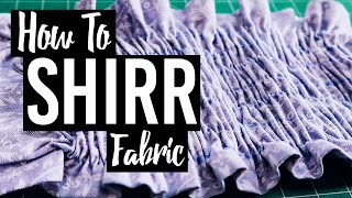
What is Shirring in Interior Design?
Shirring is an interior design technique used to create a soft and gathered effect on the fabric. It involves gathering wide fabric along both long sides to create a pleasing curve, often used to emphasize the shape of upholstered furniture such as sofas or armchairs. With shirring, you can achieve a variety of decorative effects such as ruching, pleating and tucking. This technique is a great way to add texture and visual interest to any upholstered piece. It adds dimension and softness to a room that would otherwise be lacking.
By using shirring strategically, you can create an eye-catching design element in your home that will draw attention to the piece of furniture it adorns. In addition, shirring can help create a more luxurious and comfortable feel in any room.
What is shirring used for?
Shirring is typically used to add texture and visual interest to upholstered furniture such as sofas, armchairs, ottomans, and headboards. It can also be used to enhance the curve of a piece of furniture or to create an eye-catching design element in any room. In addition to its decorative use, shirring can also be used to create a more comfortable and luxurious feel in any room.
How do you do shirring?
- Shirring is a simple technique that anyone can do with just a few basic tools.
- All you need is wide fabric, thread, scissors, and either a sewing machine or needle and thread.
- Start by measuring the length of fabric you need and cutting it to size.
- Next, use your sewing machine or needle and thread to gather the fabric along both long sides to create a soft curve.
- Finally, finish off the look by adding any desired decorative elements such as buttons, tassels, or ribbon.
What tension is shirring?
The tension used for shirring depends on the type of fabric you are using. Generally speaking, a lighter fabric will require a lighter tension (on your sewing machine) to gather the fabric and create a softer curve. It is best to experiment with different tensions until you find one that gives you the desired effect.
Related Links
A Guide To Shirring – Seamwork Magazine
Shirring Fabric: Beginner’s Tutorial
How To Create Shirring With Elastic Thread – Weallsew
DIY Shirring With Elastic Thread (& An Easy Shoulder Tie Top) – Collective Gen
Shirring
Related Videos

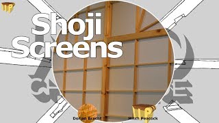
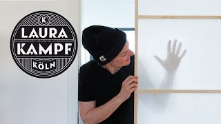
What is a Shoji Screen in Interior Design?
Shoji screens are a traditional element of Japanese interior design. They are lightweight, removable panels made of wood and paper or cloth. The translucent material allows light to pass through while maintaining privacy.
What is a Shoji Screen used for?
Shoji screens can be used as room dividers, window treatments, wall art, and decorative accents. They are an excellent way to add a unique touch to any room. They can also be used to create a sense of separation and privacy in an open space. Shoji screens are available in a variety of styles, colors, and sizes, making them perfect for any interior design project. With their versatility and timeless beauty, shoji screens are sure to add warmth, elegance, and style to any home.
What is a shoji screen for?
Shoji screens are used to create privacy and divide rooms. They can be used to divide a large room into two or more sections, providing a sense of separation while still allowing light to pass through. Shoji screens can also be used as:
- wall art,
- window treatments,
- room dividers,
- and decorative accents.
What is a shoji style?
Shoji style is the traditional Japanese design aesthetic. It combines clean lines and minimalistic shapes with natural materials like wood and paper. Shoji screens feature light, geometric frames made of wood, while the panels are made of translucent paper or cloth. The combination of these two elements creates a unique look that is both modern and timeless.
What material is used for shoji screens?
Shoji screens are typically made of wood and paper or cloth. The frames are usually made of lightweight woods such as:
- cedar,
- pine,
- or cypress.
The panels are often translucent materials such as rice paper, shoji paper, washi paper, or other types of fabric.
What colors do shoji screens come in?
Shoji screens can be found in a variety of colors and styles. From traditional black to contemporary white, you can find shoji screens in any color that complements your interior design. Other popular colors include red, blue, green, and yellow. Shoji screens also come in different sizes and shapes to suit any space.
Shoji doors
Shoji doors and windows can also be used to create a sense of separation without obscuring the view. Shoji doors are made of wood frames with panels of translucent paper or cloth, while shoji windows are usually constructed from two sets of frames, allowing more light to pass through.
Related Links
Buy Shoji Screens Online
Buy Shoji Screens Online
Shoji Screen
Shoji Screens, Room Dividers, Folding Screen – The Futon Shop
Custom Japanese Shoji Screens – Shoji Designs
Related Videos

What is a Shutter in Interior Design?
Shutters are one of the most versatile elements when it comes to interior design.
What is a Shutter used for?
Shutters can be used for functional purposes such as:
- protecting from storms,
- filtering or obscuring light,
- and blocking noise from the outside.
They can also be used for decorative purposes, with a variety of materials available in different shapes, sizes, and colors that allow you to customize the look of your window treatments. Shutters are typically made from wood or vinyl and come in either a louvered or flush frame style. They can be used:
- alone,
- paired with curtains,
- shades,
- or blinds,
- to create a unique and eye-catching design.
With so many options available, shutters can be used to add texture, color, and interest to a room while still providing necessary light, privacy, and protection. Shutters are an excellent choice for any interior design project that calls for style and functionality.
What is the purpose of interior shutters?
Interior shutters provide a variety of functions that can improve the overall look and feel of your home. Shutters can be used for privacy, light control, temperature regulation, or simply for decorative purposes. They are an ideal choice for any interior design project because they come in a wide range of materials and designs that allow you to customize the look of your window treatments. Shutters also provide additional protection from the elements, such as wind and rain, that can damage windows and walls over time. With their versatility and variety of uses, shutters are the perfect solution for any interior design project.
What is the description of shutters?
Shutters are a popular choice for windows and doors because of their versatility, durability, and aesthetic appeal. Shutters come in a variety of materials such as:
- wood,
- vinyl,
- aluminum,
- and composite.
They can be made with either louvered or flush frames depending on the desired look and function.
How to make an interior shutter?
- Interior shutters can be made from a variety of materials, such as wood, vinyl, aluminum, or composite.
- The type of material you choose will depend on the look and function you are trying to achieve.
- Once you have chosen your material it is important to measure the area where the shutter will be mounted and then cut the frame pieces according to your measurements.
- Next, you will need to assemble the frame, attach the louvers or flush panels to the frame, and then mount it in its final location. It is important to follow all instructions for proper installation.
- Once installed, shutters can be used for a variety of functions such as providing privacy, filtering light, and regulating temperature.
Exterior shutter design ideas
Popular designs include board and batten shutters, raised panel shutters, louvered shutters, and Bahama shutters. These can be used alone or paired with curtains, shades, or blinds to create a unique and eye-catching design. Exterior shutters are an excellent choice for any home as they provide necessary protection from the elements while also adding curb appeal and value. No matter what type of shutters you decide to use, the key is to have fun and get creative with your design! With a little imagination, you can create the perfect window treatment that meets both your style and functional needs.
Related Links
Window Shutters – Shade And Shutter
Shutters Carlsbad, Vista, San Marcos, Escondido, Poway, Ca – Window Shutter Sales & Installation
Plantation Shutters, Plantation Window Shutters, Faux Wood Plantation Shutters
Outdoor Window Treatments: Coverings For An Intimate, Indoor Feel
Plantation Shutters Are The Most Popular Window Shutter
Related Videos
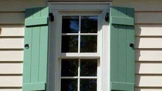
What is a Side Chair in Interior Design?
Side chairs are an essential piece of furniture for any interior design scheme. They provide additional seating and can add a decorative touch to a room. Side chairs typically have no arms, making them perfect for spaces where space is limited, such as dining areas or bedrooms. They come in a variety of styles, from contemporary designs with sleek lines to more traditional pieces with carved details and embellishments.
What is a Side Chair used for?
Side chairs can be used in many different parts of the house. They look nice in living rooms or entryways and can provide extra seating at the dining table. Side chairs will make your home look nicer.
What is the difference between a side chair and a dining chair?
While the two are often confused, side chairs and dining chairs are quite different.
- Dining chairs normally have arms, while side chairs do not.
- Side chairs are also much smaller than dining chairs and typically lack any ornate details or embellishments that you might find on a larger piece of furniture.
What is the difference between a side chair and a Parsons chair?
A side chair and a Parsons chair are similar in many ways. Both typically have no arms, and both can be used for seating in small spaces. However, the main difference between the two is their style. Side chairs come in a variety of styles and designs, from modern to traditional, while Parsons chairs feature clean lines and minimalistic details that make them ideal for contemporary interiors.
Side chair with arms
Side chairs with arms are also available, although they are far less common than armless designs. Side chairs with arms provide a little more comfort and support compared to an armless chair, making them a great choice for those who prefer extra support.
Related Links
Arm Side & Occasional Chairs – Seating
Freelance – Side Chairs – Sitonit Seating
Folio Side Chair By Laura Kirar – 9241 – Baker Furniture
Modern Side & Café Dining Chairs – Coalesse
Fine Furniture Design – Dining Chairs
Related Videos

What is a Sideboard in Interior Design?
A sideboard is a long, low-lying piece of furniture that can be used to store items such as dishes, silverware, and other dining room essentials. It often has drawers and shelves for displaying plates, crystal, silver, and other decorative items. Sideboards are usually placed against a wall in a dining or living room and can serve both functional and decorative purposes. The style of the sideboard can vary from traditional to modern and it is an important piece of furniture that adds a sense of style and elegance to any dining room or living space. Sideboards are a great way to store items out of sight while providing a beautiful display for your home. With its versatility, durability, and timeless appeal, a sideboard can be an integral part of any interior design.
What is the purpose of a sideboard?
The primary purpose of a sideboard is to provide storage and display space for dishes, silverware, linens and other items used in the dining room. It is also an ideal place to store extra serving pieces such as platters, trays and bowls.
What is a sideboard used for in a living room?
In addition to their traditional use in a dining room, sideboards can also be used in the living room. They provide additional storage and display space for books, collectibles, and other items while also adding a touch of style to the living space.
What should a sideboard include?
A sideboard is a piece of furniture that has drawers and shelves. It also has a flat surface on top that is big enough to put food or decorations. Some sideboards have extra space for things like cups or wine bottles.
What materials are used to make a sideboard?
Sideboards can be made from a variety of materials, including wood, metal, and glass. The type of material used will depend on the style of sideboard desired as well as the budget.
- Wood is a popular option for sideboards due to its classic look and durability.
- Metal sideboards can be found in both modern and traditional designs.
- While glass sideboards create an airy, light look.
What is a sideboard in a bedroom?
A sideboard is a piece of furniture that can be used in the bedroom. It looks like a long, low dresser and can store things like clothes, sheets or books.
Related Links
Dining Room Sideboards And Buffets
Sideboard
What To Do With a Sideboard
Furniture.com: Best Affordable Online Furniture Store
Yes, There Is a Difference Between a Buffet, Sideboard, Server, And Credenza – Kitchn
Related Videos
What is Silk in Interior Design?
Silk is a wonderful addition to any interior design and has been used as an exquisite fabric in various forms for centuries. It is valued for its natural properties of being strong, lightweight, and has a beautiful sheen.
What are the uses of silk at home?
Silk brings richness to any room and can be used in many ways to decorate the home including upholstery, and draperies, and to create accent pieces for a luxurious look. The natural fibers of silk also provide an element of comfort, making it a great choice for cozy living spaces. It is not only visually stunning but also provides warmth in the winter months and helps absorb heat in the summer months, making it a great choice for all seasons. Silk is an excellent choice for any interior design project and can be used to add a touch of elegance, luxury, and warmth to any room.
Why is silk used in upholstery?
Silk upholstery is a popular choice. It looks nice, feels luxurious and is comfortable. Silk also has strength and lasts a long time, so it is great to use in parts of your home that get used often. Plus, silk does not easily get stained, which makes it perfect for homes with children or pets.
What is special about silk?
Silk is one of the most luxurious materials used in interior design and its beauty and elegance can transform any space. Its natural fibers provide a unique texture, allowing light to reflect off it in subtle ways that create a light, airy feel. The sheen of silk adds a touch of sophistication and refinement to any room, making it perfect for modern or traditional designs. Silk is also hypoallergenic, which makes it a great choice for those who suffer from allergies.
Good to know: Types of fabric used in interior design
When choosing fabrics for interior design, there are many different materials to choose from. Silk is one of the most luxurious options and can be used in many ways to create a beautiful and inviting space. Other popular fabrics include cotton, linen, velvet, leather, faux fur, and jacquard fabric which all offer unique textures and colors that add interest to any room.
Related Links
What Is Silk Fabric? Guide To Silk Fabric – Ny Fashion Center Fabrics
Silk
Silk Fabric
Related Videos
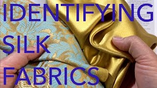

What are Sinuous Springs in Interior Design?
Sinuous springs, also known as “S coils” or “Zigzag wire”, are an important component of interior design. They are used to provide support and comfort in upholstered pieces such as sofas and chairs. Sinuous springs act like a suspension system, helping to distribute weight evenly across the seating area and giving the piece a longer lifespan. Sinuous springs are typically made from high-grade, tempered steel wire and feature a zigzag design that increases the strength and durability of the coils. The wires are then connected with cross bars or clips to create a uniform, supportive surface beneath the furniture’s upholstery material.
Are sinuous springs in a sofa good?
Yes, sinuous springs are an excellent choice for upholstered furniture. They provide superior comfort and support, helping to evenly distribute weight across the seating area. The zigzag design of the springs also helps to reduce noise and movement when people sit or recline on a sofa. Additionally, sinuous springs are highly durable and long-lasting, making them a great investment for anyone looking to upgrade their furniture.
Which spring is better for sofa?
The best type of spring for a sofa depends on the user’s needs and preferences. Sinuous springs are generally considered to be the best option because they provide superior support and comfort, while also being highly durable and long-lasting. Other types of springs such as pocket coils or 8-way hand-tied coils may be better suited for certain styles of furniture or if a softer feel is desired.
What do sinuous springs look like?
Sinuous springs have a zigzag design that is made up of individual coil wires connected with cross bars or clips. They are typically made from high-grade, tempered steel wire and have a uniform appearance when placed beneath furniture’s upholstery material. The coils can vary in size and shape depending on the type of furniture they are being used in.
Related Links
Sinuous Springs vs. Eight-Way Hand Tied – The Stated Home
What No One Told You About Buying a Sofa – Hammers And Heels
The Difference: 8-Way Hand Tied Springs vs. Sinuous Springs
Can Sinuous Springs Be a Mark Of Quality?
How To Choose a Well-Constructed Sofa – Fox News
Related Videos

What is Sisal in Interior Design?
Sisal is a popular natural fiber used in interior design, particularly for rugs. It’s a durable and resilient material that offers several advantages to home decorators looking for environmentally friendly, attractive floor coverings.
What is sisal used for?
It’s also highly versatile and can be used in a variety of applications from wall-to-wall carpets to area rugs.
Sisal is a strong and flexible material that’s similar to jute, another popular natural fiber in interior design. Sisal is popular due to its durability and relatively low cost. It’s also resistant to mold and mildew, making it an ideal choice for areas that may be exposed to moisture, like bathrooms or kitchens. In addition, sisal carpets are very easy to clean; regular vacuuming and light mopping are all that is usually required.
What material is sisal?
Sisal is a natural fiber that comes from the leaves of the Agave sisalana, an agave plant native to Mexico. It has been used for centuries in textiles and rugs and is known for its strength and durability.
What is sisal floor covering?
Sisal floor covering is a natural fiber that’s often used in interior design for rugs and carpets. It’s strong and flexible, making it an ideal choice for wall-to-wall carpets in high-traffic areas. The material is highly resilient and resistant to mold and mildew, so it’s great for use in bathrooms and kitchens. In addition, it’s easy to clean and maintain with regular vacuuming and light mopping.
Why is sisal a popular choice for interior design?
Sisal is a popular choice for interior design due to its durability, versatility, low cost, and environmental friendliness. It’s also resistant to mildew and mold, making it an ideal choice for areas that may be exposed to moisture like bathrooms or kitchens. Its natural fibers offer a unique look and feel, creating a beautiful addition to any home.
Is sisal good for bedrooms?
Yes, sisal is a great choice for bedrooms. Its natural fibers offer an inviting look and feel while remaining durable and low maintenance. The material is also resistant to mold and mildew which makes it ideal for rooms with high humidity levels such as bathrooms or kitchens.
What is a sisal carpet?
A sisal carpet is a type of floor covering made from the long fibers of the Agave sisalana plant. It’s a natural and durable material that’s ideal for areas with high foot traffic like living rooms or hallways. Sisal carpets are also relatively low-cost, easy to maintain, and available in a variety of colors and styles.
Related Links
Sisal
The Many Uses Of Sisal
Sisal Production In Tanzania
Natural Fibres From Sisal – Wild Fibres Natural Fibres
Future Fibres: Sisal
Related Videos


What is Size (Sizing) in Interior Design?
Size, or sizing, is an important component of interior design. It refers to the process of adding a protective coat to fabrics such as:
- curtains,
- wallpaper,
- and upholstery that gives them a stiffer surface and helps protect them from wear.
Size coats are usually composed of starch, glue, or oil-based solutions that adhere to the fibers of the material and form a protective layer. This helps strengthen the fabric, improving its durability and preventing fading due to washing or sun exposure. Size is used in both commercial and residential settings, as it increases the lifespan of fabrics while keeping them looking vibrant and new. It can be applied to any type of fabric that needs extra protection, making it an ideal solution for busy households and businesses. Size is an easy and cost-effective way to ensure that fabrics look their best for a long time.
Size is often used in combination with other treatments, such as stain repellents or flame retardants, to provide maximum protection against wear and tear. In addition, size can be applied in a variety of ways depending on the type of fabric and the desired effect. For example, some fabrics may require heat setting or solvent application in order to achieve the best results. Applying size correctly is essential for achieving long-lasting protection and preserving the life of any interior design project. With proper care and maintenance, fabrics treated with size can last for years, ensuring that any interior space looks its best.
What is the importance of size in interior design?
Size is an important part of any interior design project, as it helps to protect fabrics from wear and tear. By adding a protective coating to curtains, upholstery, and other fabrics, size can increase the lifespan of these materials while keeping them looking vibrant and new. In addition, size can be combined with other treatments such as stain repellents or flame retardants to provide maximum protection from wear. Finally, size is a cost-effective solution that can be applied quickly and easily to any type of fabric, making it an ideal choice for busy households and businesses.
How do you measure interior size?
Interior size is typically measured in inches and can be determined by measuring the width of the fabric from end to end. This width measurement will indicate how much size is needed for an interior design project. It is important to remember that the amount of size applied to a fabric will vary depending on the specific material and desired effect, so it is best to consult a professional for advice on the best method for measuring size. Additionally, it is also important to take into account any special treatments that may be needed in order to achieve the desired effect. For example, some fabrics may require heat setting or solvent application in order to ensure a proper application of size.
What measurements do interior designers use?
- Interior designers use a variety of measurements to ensure that projects are completed accurately and to the highest standard.
- Common measurements used by interior designers include length, width, height, area, volume, and angle.
- Additionally, measurements may also take into account special features such as windows or doorways.
What is the definition of scale in interior design?
Scale is an important concept in interior design, as it determines the proportion of objects within a space.
Related Links
Sizing
How To Use Laundry Starch And Sizing
What’s The Difference Between Starch And Sizing? – American Drycleaner
How To Identify Size Of Woven Fabrics
What Is Size Ingredients – List Of Size Ingredients And Their Functions – Textile Fashion Study
Related Videos

What is a Skirt in Interior Design?
A skirt in interior design is a type of fabric that hangs below the surface of the furniture such as couches, loveseats, and chairs. It has the appearance of a woman’s skirt because it hangs down to cover the bottom edges of the piece. In case goods, a skirt refers to the panel connecting the legs and surface of a table or chair.
What is a Skirt used for?
- Skirts are used to add visual interest and texture to furniture pieces, as well as protect the bottom edges from wear and tear.
- They can also conceal any legs that may not match the overall style of the piece.
- Skirts come in various shapes, sizes, and materials to fit any design aesthetic.
- When choosing a skirt for furniture, consider the durability of the material and whether it will be able to withstand everyday use.
- Additionally, keep in mind the overall style of the piece and pick a skirt that complements it.
- Skirts can range from simple pleated fabrics to luxurious velvet or brocade-type materials.
- No matter what type of fabric you choose, a skirt can add character and style to any piece of furniture.
What’s the purpose of skirting?
Skirting is used to add visual interest and texture to furniture, but it also offers a degree of protection for the bottom edges of furniture. It can help prevent wear and tear on the legs and frame of a piece, as well as conceal any mismatched legs or hardware. Skirting also helps keep dust from accumulating around a piece, making it easier to clean. Furthermore, it can be used to add extra seating space if needed.
What are skirting boards called?
Skirting boards, also known as baseboards or base molding, are strips of wood that act as a buffer between the wall and floor. They come in various shapes and sizes, and can be stained, painted, or textured to match any design aesthetic. Skirting boards provide additional protection from damage to the walls and floors, as well as a decorative touch to any space.
What material is used for skirting?
Skirting can be made from a variety of materials, including:
- wood,
- fabric,
- plastic,
- vinyl,
- and metal.
Wood is the most common material used for skirting boards, as it adds a classic look and is easy to install. Fabric skirts can come in an array of colors and patterns to add visual interest to a room. Plastic or vinyl skirts are also an option, as they can be easily wiped down and resist wear and tear. Metal skirts are a great choice for modern spaces, as they come in sleek designs that add a unique touch to any room.
What is flush skirting?
Flush skirting is a type of skirt that sits close to the floor, creating a seamless look. This style of skirting is often used in modern and contemporary designs, as it gives furniture a more streamlined appearance. Flush skirting can also be beneficial if you have pets or small children, as it prevents them from easily accessing underneath the furniture.
Wall skirtings
They are also available, which are thin strips of material that go between the wall and floor. This type of skirting can help protect your walls from damage, as well as give a room a more finished look. Wall skirting is often used in commercial buildings to cover up any wires or pipes that may be present.
Related Links
Custom Skirt Options
Sofa Skirt
Sofa Secrets: Skirts, Slipcovers And Legs
How To Make a Pleated Skirt For a Sofa – Dummies
Skirted Sofas: When And How To Choose Them
Related Videos

What is a Slant-Front Desk in Interior Design?
A slant-front desk is a traditional piece of furniture that has been around for centuries. It is typically characterized by its hinged lid, which slopes at an angle of 45 degrees when closed.
What is a Slant-Front Desk used for?
In interior design, it can be used as either a writing desk or an accent piece in any room. The slanted top provides a unique visual interest and its drawers make it a versatile storage solution.
What is a Slant-Front Desk made from?
The desk can be made from a range of materials such as:
- wood,
- metal,
- or even plastic.
It is a timeless piece that can add an air of sophistication to any home. Whether used for work or pleasure, the slant-front desk will make an impression in any space.
The slant-front desk is the perfect mix of form and function; it adds a touch of vintage style to any room while providing ample storage for documents, writing materials, or other items. It can also be used as an accent piece for displaying photographs or other items. Thanks to its classic lines and neutral color palette, it blends well with any style of décor. Whether used in a study, office, or living room, the slant-front desk can bring an elegant touch to any space.
Advantages of a Slant-Front Desk
The slant-front desk provides several advantages when used in interior design.
- It is a classic piece that never goes out of style, and it can easily be integrated into any room.
- It has plenty of storage space for documents and other materials, and the angled lid allows easy access to whatever is inside.
- The desk also adds an extra layer of visual interest to any room, thanks to its traditional design.
- Whether used as a writing desk or an accent piece, the slant-front desk will be sure to bring a touch of charm and sophistication to any interior space.
Disadvantages of a Slant-Front Desk
The slant-front desk is not without its drawbacks.
- The angled lid can be difficult to keep open when in use, and the low clearance of the desk means it may not be suitable for taller people.
- Additionally, the desk can be pretty heavy if made from wood or metal, making it a challenge.
- Finally, it is important to remember that the desk may require some upkeep over time due to its delicate nature.
Related Links
Slant-Front Desk – Woodworking Project – Woodsmith Plans
Slant-Front Desk – Plan 504365
Slant-Front Desk · George Washington’s Mount Vernon
Slant Front Desk On Frame – Finewoodworking
Slant-Front Secretary Woodworking Plan, Furniture Desks
Related Videos
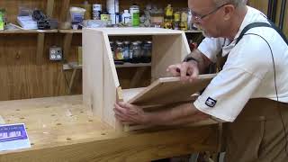

What is Slat Back in Interior Design?
The Slat Back is a style of furniture that has been used in interior design since the late 1700s.
What is characteristic of the Slat Back?
It is characterized by its horizontal slats, typically made of wood, which runs across the back and sides of the piece. This type of chair was commonly found in early American homes and was popular for its affordability and durability.
Why is Slat Back so popular?
Today, many furniture designers incorporate Slat Back designs into their pieces, creating modern pieces that still reflect the classic look of the originals. The Slat Back is a timeless style that has stood the test of time and continues to be popular in many homes today. Whether used as an accent piece or as part of a larger ensemble, this type of chair can add a touch of classic charm to any room.
Slat Back chairs
- Slat Back chairs are also a great choice for outdoor furniture, as the slats provide good ventilation and protection from the elements.
- These pieces can be crafted from materials such as cedar, pine, or teakwood and will last for many years with proper care and maintenance.
- Additionally, they come in a variety of styles, from rustic to contemporary, making them a great addition to any outdoor space.
- They also look great on porches and patios, creating a comfortable seating area that is sure to make any gathering more enjoyable.
Conclusion
In conclusion, the Slat Back chair is an iconic piece of furniture that has been around for centuries. It offers timeless style and durability, making it a great choice for any home. Whether used as an accent piece or part of a larger ensemble, this type of chair is sure to add a touch of classic charm to any room.
Additionally, its versatility makes it ideal for outdoor spaces, providing protection from the elements while creating a comfortable seating area that’s perfect for gatherings. Whether you’re looking to bring some classic style into your home or create a cozy outdoor seating area, the Slat Back chair is an excellent choice.
Related Links
Value City Furniture And Mattresses – Designer Furniture At Value Prices
American Signature Furniture – We Make Furniture Shopping Easy
Slat Back Chairs In Europe And America – Collectors Weekly
Slat Back Dining Chairs – Dining Room & Bar Furniture Online
Related Videos
What are Slats in Interior Design?
Slats are thin, narrow pieces of wood used for various purposes in interior design. They are used to construct frames and provide structure and stability to the furniture. Slats can be found in the bottom of box springs and mattresses, as well as headboards, footboards, and bunk bed frames. They give the furniture a distinctive look and style and are most commonly seen in mission and arts and crafts furniture.
Slats provide a strong foundation for your furniture while adding an interesting visual element that can tie together the entire room. With so many styles and colors available, they offer endless possibilities to any interior design project. Whether you’re looking for something traditional or modern, slats can be used to create the perfect look. Furthermore, slats are relatively inexpensive and easy to install, making them an ideal choice for any home.
What are examples of slats?
Some examples of slats include:
- Box spring and mattress frames.
- Headboards, footboards, and bunk bed frames.
- Mission furniture.
- Arts and crafts furnishings.
- Chair parts.
Slats are an essential component of any interior design project. With so many options to choose from, it’s easy to find the perfect slat for your needs. Whether you’re looking for something traditional or modern, slats can provide a strong foundation and an interesting visual element that will tie together the entire room. Start shopping today to bring your interior design project to life!
What are the Benefits of Slats?
Slats are an ideal choice for any home due to their numerous benefits. They offer a strong foundation and structure for furniture, as well as stability. Slats also provide an interesting visual element that can tie together the entire room. Furthermore, they are relatively inexpensive and easy to install, making them an economical choice for any budget. With so many styles and colors available, slats offer endless possibilities to any interior design project.
What are slats on a wall?
Slats on a wall are thin strips of wood, metal, or plastic used to create texture and design elements in the room. They can be painted or stained in various colors to coordinate with other decor items in the space. Slats on a wall can be used to hide outlets or light switches, as well as draw attention to certain features in the room. Slats on a wall are also great for creating an accent wall, adding texture and interest to any room. They can be mixed and matched with other materials or used as a standalone element to create a unique look.
What is a slatted design?
A slatted design is a type of furniture construction that uses thin, narrow pieces of wood to create a unique look. This type of construction is commonly seen in mission and arts and crafts furnishings. Slatted designs provide structure, stability, and visual interest all at the same time. By combining different materials such as:
- wood,
- metal,
- or plastic,
- slatted designs can be used to create a variety of looks and textures.
With so many options available, it’s easy to find the perfect look for your interior design project. Start shopping today!
Is a slat wall a good idea?
A slat wall is an excellent idea for any interior design project. Slats on a wall can be used to create texture and interest, as well as hide outlets or light switches. They are also great for creating an accent wall, adding dimension and visual appeal to the space. Slats on a wall come in various materials, styles, and colors, making them an ideal choice for any room. With so many options available, it’s easy to find the perfect look for your home.
Wood slat door
A wood slat door is a type of door made up of thin, narrow pieces of wood arranged in a lattice pattern. This type of door offers an interesting visual element that can be used to create texture and design interest in any room. Wood slat doors are often used as interior doors or closet doors but can also be used as a feature in furniture construction. By combining different types of materials and finishes, wood slat doors can be used to create a unique and eye-catching look for your home. Start shopping today to find the perfect door for your interior design project!
Related Links
A Queen Bed: How Many Slats And What Type Of Wood? – Hunker
Bed Slats vs. Box Spring: Which One Is The Best For You?
Do Beds With Slats Need a Box Spring? – Home Guides
What Is The Purpose Of Bed Slats?
Related Videos
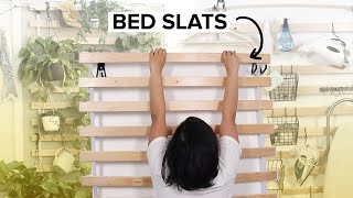
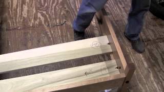

What is a Sleeper (or Hide-A-Bed) in Interior Design?
A sleeper (or Hide-A-Bed) is a seating option in interior design that allows for the use of a single piece of furniture to serve multiple functions. This type of furniture, typically a sofa, loveseat, or chair, can be converted into a bed when needed. Some sectionals may even include sleeper options as well. Sleeper furniture is a great option for small spaces, as it allows for the same piece of furniture to serve multiple purposes. It’s also ideal for when you need extra sleeping space but doesn’t have room for a traditional bed frame and mattress.
Sleeper furniture can come in many different styles, colors, and fabrics to fit any design aesthetic or budget. Whether you’re looking for a more traditional style or a modern, contemporary look, there’s sure to be the perfect sleeper sofa out there for any room. With its dual functionality and versatile design options, it’s no wonder why sleeper furniture is so popular in interior design today.
What is a sleeper sofa bed?
A sleeper sofa bed is a type of furniture that combines the convenience and comfort of a traditional sofa with the flexibility and added sleeping space of a bed. Sleeper sofas are constructed in one piece, with an attached mattress concealed underneath its upholstery. When needed, these mattresses can be pulled out to create extra sleeping space for guests.
What’s the difference between a sofa bed and a sleeper sofa?
The main difference between a sofa bed and a sleeper sofa is that the latter does not require you to remove the cushions when converting it from a couch to a bed.
- With a sleeper sofa, all you have to do is unfold the mattress hidden beneath its upholstery, whereas, with a traditional sofa bed, you must first remove the cushions before unfolding the mattress.
- This makes sleeper sofas much more convenient and easier to set up.
- In addition, sleeper sofas provide a higher quality of sleep due to their thick mattresses and better support systems.
What are the features of a sleeper sofa?
The features of a sleeper sofa can vary depending on the model, but generally, they include:
- A foldable mattress concealed underneath its upholstery that can be pulled out when needed.
- Storage solutions such as drawers or shelves for extra convenience.
- High-quality construction and materials for long-lasting durability.
- A variety of sizes, styles, and colors to fit any design aesthetic or budget.
- Comfortable padding and support systems for a better night’s sleep.
- Adjustable headrests to provide extra neck and back support.
Overall, sleeper sofas are an excellent choice for anyone looking for extra sleeping space without sacrificing comfort and style. With their versatile design and dual functionality, sleeper sofas are sure to make a great addition to any room.
Related Links
Hide-a-bed
Hide-a-bed
Sofa Beds For Sale
Sleeper Sofas – Ashley Furniture Homestore
Sleepers, Sofa Beds & Hide-A-Beds – Sc41 Santa Cruz Furniture & Mattress
Related Videos


What is a Sleepy Hallow Chair in Interior Design?
A Sleepy Hallow Chair is a popular piece of furniture in interior design. It features a large upholstered chair with a hollowed seat, a high back, and solid low arms. The combination of these elements makes it extremely comfortable for those who want to relax and unwind. It’s a perfect addition to any living room or bedroom, as its functional and stylish design adds a touch of sophistication to any space.
Its a timeless design and classic look make it an ideal piece for any home. With its unique shape, the Sleepy Hallow Chair is sure to stand out in your interior!
What is the meaning of hollow chairs?
Hollow chairs refer to a type of furniture that features an open seat, usually with no cushioning. This design provides structural support while keeping the chair lightweight and easy to move. The hollow space also helps air circulate more freely, making them ideal for hot climates. Hollow chairs are popular in both traditional and modern designs, as they can be easily adapted to different styles. They are also a great choice for smaller spaces, as they take up less space than more traditional chairs.
What type of fabric is best suited for Sleepy Hallow Chairs?
The best type of fabric to use on a Sleepy Hallow Chair is one that is durable and comfortable. Look for fabrics with higher thread counts and thicker weaves for added strength and longevity. Soft materials with a bit of stretch, such as velvet or corduroy, are also great options that will provide comfort while still being able to stand up to regular use. Natural fibers like cotton and linen are also good choices as they are breathable and allow air to circulate freely. Be sure to choose a color and pattern that will work with your existing décor.
What type of décor pairs well with Sleepy Hallow Chairs?
Sleepy Hallow Chairs are versatile pieces that can easily fit into almost any interior design style. They look great in modern, contemporary, and traditional spaces alike. To create the perfect look for your room, pair the chair with pieces that have similar colors and finishes. For a more relaxed vibe, add natural elements such as wooden furniture or earthy tones. To give it an air of sophistication, choose items like glass lamps or sleek metal accents. Whichever style you choose, the Sleepy Hallow Chair will make a great addition to your décor.
Conclusion
Overall, the Sleepy Hallow Chair is a timeless piece of furniture that adds a touch of comfort and style to any space. With its unique design, this chair will help you create an inviting atmosphere in your home. Whether you choose a traditional or modern look, it’s sure to give your décor an eye-catching flair!
Related Links
All Stanton Sleeper Furniture – Sleepersinseattle.com
King Sleeper Sofa Sleeper Sofa Leather Queen Hide a Bed Couch
Rustic Fabric Hide-A-Way Bed And Sleeper Sofas
Sleeper Sofa Roundup
Related Videos
What is a Sleigh Bed in Interior Design?
Sleigh beds are a timeless classic in interior design that has been around since the turn of the 19th century. They represent a blend of American and French Empire designs, featuring curved headboards and footboards that resemble the front of a sleigh. This look is often topped off with carved or detailed posts for an added touch of elegance.
Today, sleigh beds can be found in both modern and traditional designs, making them a versatile choice for any bedroom. Sleigh beds also come in a variety of sizes, from single to king-size, so there is sure to be one to fit your space perfectly. Whether you’re looking for a statement piece or something more subtle, sleigh beds provide a timeless look that will never go out of style. With their classic design and versatility, they are sure to be the perfect addition to any bedroom.
Sleigh beds are also extremely comfortable as well as stylish, making them ideal for creating an inviting place to rest and relax at the end of the day. Many sleigh beds feature deep springs for extra cushioning, and some even have built-in storage options like drawers or shelves. This makes them a great choice for anyone looking to maximize the space in their bedroom while still achieving a stylish look. Sleigh beds are also relatively easy to maintain and can last for decades if cared for properly. With its combination of classic design, comfort, and durability, a sleigh bed is a perfect addition to any bedroom.
What is the use of a sleigh bed?
A sleigh bed is a great option for any bedroom, offering style and comfort in one package. Its timeless design can add an elegant touch to any room, while its versatility makes it easy to find the perfect size and style for your space. Sleigh beds are also comfortable and can come with built-in storage options like drawers or shelves, making them a smart choice for anyone looking to make the most of their bedroom. Additionally, they are relatively easy to maintain and can last for years if properly cared for. With its timeless design, comfort, and durability, a sleigh bed is an ideal choice for any bedroom.
What era are sleighed beds from?
Sleigh beds have been around since the turn of the 19th century when they were first introduced as a blend of American and French Empire designs. This look featured curved headboards and footboards that resemble the front of a sleigh, often topped off with carved or detailed posts. Since then, sleigh beds have remained popular in both modern and traditional designs, making them a timeless choice for any bedroom.
What materials are sleigh beds made of?
Sleigh beds can be made from a variety of materials, including:
- wood,
- metal,
- or even upholstered fabric.
Wood is the most common material used to make sleigh beds, as it offers strength and durability while still looking beautiful. Metal sleigh beds are usually made of iron or brass and often feature detailed designs that add a touch of elegance to any bedroom.
What year were sleigh beds popular?
Sleigh beds have been a popular choice in interior design since they were first introduced in the early 19th century. Since then, their popularity has continued to grow and they are now found in both modern and traditional designs. Sleigh beds have remained popular for centuries due to their classic look, comfort, and versatility. They are sure to be a timeless addition to any bedroom.
What colors do sleigh beds come in?
Sleigh beds can typically be found in a variety of colors and finishes, from light woods like pine or maple to dark woods like mahogany or cherry. Metal sleigh beds can also be found in various shades of brass, bronze, copper, and iron. Upholstered sleigh beds can be found in many different fabrics, from velvet and chenille to leather and suede. With so many options available, you are sure to find the perfect color or finish for your sleigh bed.
Are sleigh beds out of style?
No, sleigh beds are not out of style. With their timeless design and versatility, they have remained popular over the years and remain a stylish choice for any bedroom. Sleigh beds offer comfort, durability, and a classic look that never goes out of style. They are sure to be an elegant addition to any room for years to come.
Related Links
Bittersweet Queen Sleigh Bed With Storage – B219/50/63/65/86 – Complete Beds – Akins Furniture
King Sleigh Bed – Durham Furniture
La Rochelle Sleigh Bed, Classics Cherry Collection – Stickley Furniture
Buy Sophia Cherry 3 Pc King Sleigh Bed – Part# Bd258-01-1/2/3 – Badcock & More
Sleigh Bed
Related Videos
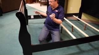
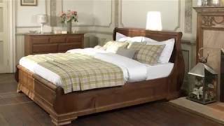

What is a Slip Match in Interior Design?
Slip match is a technique often used in interior design to create decorative patterns with wood veneer. The process involves cutting thinly sliced sheets of wood veneer and arranging them side-by-side to form various designs, such as:
- diamond,
- sunburst,
- herringbone,
- and checkerboard patterns.
This unique decorative method can be used for many applications, such as:
- wall panels,
- cabinetry,
- and furniture.
Slip match allows for a creative way to add texture and dimension to any space. The end result is a beautiful look that adds visual interest to the area. When done right, slip match is an effective design tool that can make any room stand out with its intricate patterning.
What is the difference between a book match and a slip match?
Book match and slip match are both techniques used in interior design to create decorative patterns with wood veneer. The main difference between them is that book match involves cutting two sheets of veneer in half lengthwise and then joining the halves together so that the pattern on one piece continues onto the next. Slip match, on the other hand, involves slipping two or more sheets of veneer side by side to create patterns such as diamond, sunburst, herringbone, and checkerboard. Both methods offer a unique way to add texture and dimension to any space, but slip match is generally used for wider applications that require intricate patterning.
What is the purpose of veneer matching?
Veneer matching is a technique used in interior design to create decorative patterns with wood veneer. This process involves cutting thin sheets of veneer and arranging them side by side in specific patterns, such as diamond, sunburst, herringbone, and checkerboard. The purpose of this type of patterning is to add texture and dimension to any space, as well as create a unique look that adds visual interest. It is also used for various applications such as wall panels, cabinetry, and furniture. Veneer matching is an effective design tool that can help make any room stand out with its intricate patterning.
What are the benefits of a slip match?
The benefits of slip match include that it is an effective design tool to add texture and dimension to any space, as well as create a unique look that adds visual interest.
- Slip match can be used for various applications such as wall panels, cabinetry, and furniture. It also allows for creative ways to make any room stand out with its intricate patterning.
- Another advantage of slip match is that it can be done quickly and easily, allowing for a low-cost solution when it comes to creating decorative patterns with wood veneer.
- Finally, slip match is also very versatile in terms of the type of designs that can be created.
- From diamond, sunburst, herringbone, and checkerboard patterns, there are a variety of patterns that can be created to fit any space and style.
What is a balanced match?
A balanced match is a type of slip-match technique used in interior design to create decorative patterns with wood veneer. This process involves cutting thin sheets of veneer and arranging them side-by-side in a symmetrical manner, such as diamond, sunburst, herringbone, and checkerboard patterns. The purpose of this method is to evenly distribute the patterns between two pieces of veneer, creating a balanced look. It can be used for various applications such as wall panels, cabinetry, and furniture, adding texture and dimension while creating an eye-catching pattern.
Related Links
Matching – Dooge Veneers
Veneernet
Wood Veneer Matching
Slip Matching – Finewoods
Matching
Related Videos
What is a Slipper Chair in Interior Design?
A Slipper Chair is a type of armless upholstered chair that has been used in interior design for centuries. Generally, slipper chairs are characterized by their low seat and skirt, giving them a distinct look from other types of chairs. Slipper Chairs can be used to add an inviting touch to any room in the home.
They can be found in a variety of fabrics and styles, allowing them to blend into any decor scheme. These versatile chairs are perfect for adding extra seating in a living room, den, bedroom, or office.
In addition to providing additional seating options, slipper chairs can also be used as accent pieces that draw the eye and create visual interest within a space. The low-profile design of a Slipper Chair also makes them ideal for smaller spaces, where they can be tucked away in a corner or used as an entryway piece. Whether used as the focal point of a room or a simple accent piece, slipper chairs are sure to bring style and comfort to any home.
What is the difference between a side chair and a slipper chair?
The main difference between a side chair and a slipper chair is in the design.
- Side chairs have arms and are usually taller than slipper chairs, while slipper chair has no arms and is typically shorter.
- Slipper chairs can be used as accent pieces, due to their low-profile design, whereas side chairs are often used for seating.
- Slipper chairs are also usually more comfortable than side chairs since they have no arms and a lower seat.
When choosing between a side chair and a slipper chair, it is important to consider the desired look of the room as well as its purpose. Side chairs can be used for dining or office spaces, while slipper chairs are best suited for living rooms and bedrooms.
What does a slipper chair look like?
A slipper chair typically has a low-profile design, with a seat and skirt. It is usually armless, although some versions may feature arms or rolled arms. Slipper chairs can be found in a variety of fabrics and colors, making them suitable for any room in the home. They are usually shorter than side chairs and often have cushions on the seat and back.
Can you use a slipper chair in the living room?
Yes, slipper chairs can be used in the living room to provide extra seating and an inviting touch. Slipper chairs can be used as entryway pieces or tucked away in a corner to draw the eye and create visual interest within a space.
Antique slipper chair
Antique slipper chair styles are perfect for traditional living rooms, while modern designs can add a contemporary touch. When choosing a slipper chair for the living room, it is important to consider the existing decor and desired look of the space.
Slipper chairs are also great for smaller spaces since they take up less floor space than other types of chairs. No matter the design, they are sure to add a unique touch and comfort to any living room.
Related Links
Slipper Accent Chairs – Interior Define – Interior Define
Slipper Chair – One Kings Lane
Encuentra Sillones Y Butacas En Houzz
Amal Slipper Chair – Ballard Designs
Watson Slipper Chair – Serena & Lily
Related Videos

What is a Slub in Interior Design?
In interior design, a slub is an uneven section of yarn used to give fabric and upholstery a textured look. This can add visual interest and texture to a space, while also having the benefit of making furniture pieces more durable. Slubs are usually created by using thicker threads or yarns that have been twisted in different directions.
What is a Slub used for?
Slubs can be used in a variety of different fabrics and upholstery pieces, such as;
- curtains,
- furniture covers,
- throw pillows,
- bed linens, and more.
The use of slub yarns can also add extra durability to these items by providing a little extra resistance to wear and tear. With their unique look and versatile application, slubs can be used to add both aesthetic and functional value to any interior design project.
What does slub design mean?
Slub design is a way of making fabrics. It is used to make fabrics that look cool and last a long time.
What does slub texture mean?
Slub texture is the uneven and slightly raised texture created by slubs in a weave or knit. It can range from light and subtle to more pronounced, depending on the type of yarn and how much is used. Slub textures add visual interest and depth to any fabric or upholstery piece they are used in.
What are the kinds of slub?
There are different types of yarn used in interior design. They range from thin and smooth to thick and bulky. Choose the yarn that fits the texture, strength, and look you want for your fabric or furniture.
What defines a slub top?
A slub top is a type of fabric that has uneven sections. It can be used to make things look more interesting and feel different. Slub tops are made with thicker threads or yarns. They are twisted in different ways which give the fabric different looks and textures, from subtle to very noticeable.
Related Links
Textile Industry Blog – Charles Parsons Interiors Blog – What Is Slubbed Fabric?
What Is The Hype With Slub Cotton? – American Made Supply Co
Cotton Slub Fabric, ???? ????? ?? ???? At Rs 50 /Meter – Cotton Slub Fabric – Id: 13776365388
Slub Yarn – Heddels
What Is a Slub Knit Cotton?
Related Videos

What is a Sofa Table in Interior Design?
A sofa table is a piece of furniture that sits behind a couch or loveseat, usually positioned away from the wall and in the middle of the room. It serves both decorative and functional purposes, providing storage space for smaller items such as:
- books,
- magazines,
- remotes,
- and other small objects.
What is a Sofa Table used for?
The tabletop of a sofa table can also be used to display family photos, lamps, and other decorative items. Sofa tables usually measure between 30″ and 36″ tall, with a length that corresponds to the width of the couch or loveseat it is placed behind. The top surface can be made from a range of materials such as:
- wood,
- laminate,
- glass,
- or metal.
Sofa tables are a great way to add style and function to any living room.
When it comes to styling a sofa table, there are many options. For a traditional look, you can place lamps on either end of the table with books or other decorative items in between. If you want something more contemporary, consider incorporating elements like artwork or sculptures. You can also add plants or floral arrangements to bring a sense of nature into your home. Whichever look you prefer, the right sofa table can make all the difference in how your living room looks and feels.
What is the difference between an entry table and a sofa table?
An entry table is a piece of furniture that stands near the entrance to your home and can be used for decorative or utilitarian purposes. It’s typically taller than a sofa table, often around 36-40 inches in height. Entry tables are usually narrow, so they don’t take up much space in a hallway or foyer.
What are the advantages of sofa tables?
- Sofa tables offer a great way to add style and function to a living room.
- They provide storage space for small items like books, magazines, remotes, and other objects.
- And the top surface can be used to display decorative pieces like lamps and family photos.
- Sofa tables are also very versatile; depending on your design preferences, you can choose a traditional or contemporary style.
- Finally, they’re often very affordable, making them a great choice if you’re looking to add a touch of style to your home without breaking the bank.
What is the table in front of the sofa called?
The table in front of the sofa is typically called a coffee table. Coffee tables are generally lower than sofa tables, and they’re used to hold drinks and snacks while watching TV or entertaining guests. They can also be used to display decorative items such as books and plants.
Related Links
Sofa Tables – Living Spaces
How To Choose The Perfect Sofa Table – Top 35 Best ???????? ?????????? ?????????? For ????????
Sofa Tables & Console Tables – Art Van Home
Sofa Tables Made Of Wood, Metal & Glass – Havertys
Related Videos
What is a Sofa in Interior Design?
A sofa is an essential piece of furniture in any home, but it can also be a stylish addition to your interior design. A sofa is a long upholstered seating piece with a back and arms that can seat three or more people. Sofas come in all shapes and sizes, from sectionals to love seats, and are usually the largest piece of furniture in a room. Many sofas come with soft fabric upholstery, but leather and microfiber options are also available to fit any style.
What is a Sofa used for?
Sofas can be used as the focal point of living space, or as an accent piece to coordinate with your existing design. With the right sofa, you can create a space that is cozy and inviting while still looking stylish and modern. Whether you choose a classic silhouette or something more contemporary, adding a sofa to your interior design can make it look complete.
When you are browsing for a sofa, it is important to take your time and consider the different features available. Measure the size of your living space to make sure that the sofa will fit comfortably in the room. Look at how much padding and cushioning is included, as well as its construction materials to ensure that your sofa is strong and durable. Think about the style and color of your sofa, as this can make a big impact on the overall look of your living space. With so many choices available, you will be sure to find the perfect sofa for your home.
Sofas are an essential part of any interior design scheme, and they are available in a wide variety of styles and colors to suit any space. From traditional tufted pieces to modern leather options, a sofa is a perfect way to complete your living room design. With careful consideration, you can choose a piece that will look great in your home while offering comfortable seating for years to come.
What is couch vs sofa in interior design?
Couches and sofas are often used interchangeably, but they actually have a few distinct differences.
- The sofa is the more general term to describe a long upholstered seating piece with a back and arms that can seat three or more people, while the couch typically refers to a piece of furniture with two arms and no back.
- Couches are usually shorter than sofas, making them a better fit for smaller rooms, and they tend to be less expensive.
- Sofas come in all shapes and sizes, with options like sectionals and love seats that provide more flexible seating arrangements compared to couches.
Both couches and sofas can make great additions to any interior design, but it is important to take the differences into consideration when making your selection.
What is the importance of a sofa in interior design?
The sofa is an essential part of any interior design, as it sets the tone and atmosphere for the entire room. It is usually the largest piece of furniture in a room and can be used to create a focal point or link together different elements of your decor.
What is the role of the sofa?
A sofa is for comfortable seating and it can add color and texture to a room. It creates a cozy space for talking or watching TV. A sofa can also help to separate different parts of the room.
Related Links
Couch vs. Sofa – Couch Definition And Sofa Definition
What’s The Difference Between Sofa And Couch?
Sofa vs. Couch: What Are The Differences
Couch vs. Sofa: What’s The Difference?Nest And Home Blog
The Difference Between Couch And Sofa, Just In Case You Didn’T Know
Related Videos

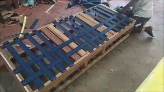
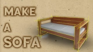
What is Soft Wood in Interior Design?
Soft wood is a type of timber that comes from coniferous trees such as pine and cedar.
What is Soft Wood used for?
It can be used in interior design for many different purposes including:
- furniture,
- flooring,
- paneling, and more.
Soft wood has several advantages over hardwood when it comes to interior design. These include its affordability and the fact that it is relatively easy to work with. In addition, soft wood is lightweight and can be stained or treated in various ways to achieve a specific aesthetic look. Soft wood also has the advantage of being very durable and long lasting, making it an ideal choice for interior design projects. For these reasons, many designers prefer to use soft wood when crafting their home’s interior.
However, it is important to note that soft woods are more prone to damage caused by insects and rot, so they must be treated properly in order to ensure their longevity. Additionally, some soft woods can require a bit more sanding and smoothing than hardwoods when finishing the project. Despite these drawbacks, the advantages of using soft wood in interior design make it a popular choice among professionals and homeowners alike. By taking the time to properly care for and treat this type of timber, you can create beautiful, long-lasting designs that are sure to impress.
What is an example of soft wood?
Pine is a type of soft wood. It is used to make furniture and other pieces that go inside houses. It is affordable and light, but strong enough to be shaped into the things you want it to look like. Pine comes from different types of trees so you have to research which kind will work best for your project. Other types of soft wood include cedar, spruce, and fir. Each type has special qualities that make it good for inside projects.
What are 4 examples of soft wood?
- Pine.
- Cedar.
- Spruce.
- Fir.
These are all examples of soft wood that can be used in interior design projects. Each species offers its own unique advantages, so it’s important to research each type in order to find the best fit for your home.
What is softwood internal structure?
Softwood’s internal structure consists of lignin, cellulose, hemicellulose, and other substances that together form the basic components of wood. The structure of softwood differs from hardwood in terms of its lighter weight, more porous nature, and higher resistance to bending forces. Softwoods are generally used for framing, furniture-making, and exterior siding.
Related Links
Softwood
What Is Softwood? – Definition Of Softwood
Softwood
Top Ten Softest Woods – The Wood Database
What Is The Difference Between a Hardwood And a Softwood? – Howstuffworks
Related Videos


What is Southwestern in Interior Design?
Southwestern in interior design is a style that celebrates the culture and artistry of Native American Indian traditions. It embraces the beauty of desert landscapes, incorporating light-colored woods, sandy materials, muted colors, geometric shapes, and rich patterns.
This style emphasizes natural elements such as exposed stone walls and wood beams to capture the rustic feel of living close to nature. Furniture pieces often feature rounded edges and clean lines, while fabrics include earthy tones, geometric patterns, and complementary colors for a classic Southwestern look. This style is best suited for open-plan living spaces that are filled with natural light. You can also accentuate the space with vibrant desert scenes in artwork to bring the outdoors indoors and to bring your Southwestern style alive.
Overall, the Southwestern style is an ideal choice if you’re looking for a timeless and homey look that celebrates the artistry of Native American culture. With its light materials, traditional decor pieces, natural elements, and desert-inspired color palette, this design will instantly transform your living space into a cozy and inviting haven.
By incorporating this style into your home, you can create an elegant and comfortable environment that will last for many years to come. Welcome people into your home with the warm embrace of Southwestern interior design!
What is a southwestern-style house?
A southwestern-style house is decorated in a way that is inspired by Native American culture. It usually has light-colored woods and bright colors. The walls may be stone or have wood beams. The furniture has rounded edges and the fabrics are earthy tones with geometric patterns. Everything together makes your home cozy and inviting. This style of house is great for people who like classic beauty, big rooms, and being close to nature. It has a warm feeling and looks like something Native Americans would make. It can be a beautiful home for many years.
How can I make my house look southwestern?
- To make your house look southwestern, choose furniture pieces with rounded edges and clean lines.
- Incorporate light-colored woods and fabrics with earthy tones or geometric patterns for a classic Southwestern look.
- Introduce pops of color with vibrant desert scenes in artwork to bring the outdoors indoors.
- Add natural elements such as exposed stone walls and wood beams to capture the rustic feel of living close to nature.
- Finally, make sure that your home is filled with natural light as this will create an even cozier atmosphere and allow your Southwestern style to be fully appreciated.
Is Southwestern decor popular?
Yes, Southwestern decor is a popular style of interior design. This style celebrates the culture and artistry of Native American Indian traditions, emphasizing natural elements such as exposed stone walls, wood beams, and light-colored woods to capture the rustic feel of living close to nature. It also includes muted:
- colors,
- geometric shapes,
- and rich patterns for an elegant and comfortable atmosphere.
With its timeless beauty and warm, inviting look, it’s no wonder why Southwestern decor is so popular!
Modern southwestern interior design
It is popular for its combination of classic and contemporary styles. It features a light-colored palette, with muted colors, geometric shapes, and patterns, plus natural elements like stone walls, wood beams, and light woods. The overall feel is one of cozy comfort that celebrates the artistry of Native American culture. Modern southwestern decor can be used to create an inviting atmosphere in any room, with a mix of traditional and modern elements to create an elegant yet comfortable space.
Related Links
Interior Details for Southwestern Style
Decorating with Southwestern Style
So Your Style Is: Southwestern
Design Style 101: Southwestern – a Beautiful Mess
Southwestern Style 101
Related Videos

What is a Spade Foot in Interior Design?
The Spade Foot is a classic design element in interior design, often associated with the Hepplewhite style. It is characterized by four legs that taper from the top to the bottom and flare out at their bases. The shape resembles that of a spade or shovel head, hence its name.
What is a Spade Foot used for?
Although it was originally used for furniture in the Hepplewhite style, it has since been adapted to many other styles of furniture and decorative objects. The Spade Foot is a timeless design element that can be used to add visual interest and contrast to any space. It can be used in modern or traditional interiors to create an elegant, distinctive look. In addition, the Spade Foot is strong and sturdy, making it an ideal choice for furniture that will be used frequently.
Important to note
It is important to note that the Spade Foot is not exclusive to the Hepplewhite style. It can be found in other styles of furniture and decorative objects, including modern or contemporary design. Additionally, there are several variations on the classic shape, such as the saber foot or club foot. No matter which style is chosen, the Spade Foot is sure to add a unique and timeless touch to any interior design.
What are spade feet in furniture?
Spade feet are a common design element in furniture. The characteristic four legs of these pieces taper from the top to the bottom and then flare outward at their bases. This shape resembles that of a spade or shovel, hence its name. Spade feet can be found in many different styles of furniture, such as Hepplewhite, Chippendale, and Queen Anne.
However, they have also been adapted to more modern designs as well. Spade feet are often made from hardwood such as mahogany or cherry and can be stained or painted to match the furniture’s overall design.
What are furniture feet called?
Furniture feet are the parts of a piece of furniture that support it and lift it off the ground. While there is no single name for all types of furniture feet, some common terms include:
- bun feet,
- tapered legs,
- cabriole legs,
- claw-and-ball feet,
- saber legs,
- and spade feet.
Different styles of furniture feet can be used to add visual interest and contrast to any piece of furniture.
What are chair feet called?
Chair feet are the parts of a chair that support it and lift it off the ground. Common names for chair feet include cabriole legs, spade feet, claw-and-ball feet, and bun feet. Different styles of chair feet can be used to add visual interest and contrast to any type of chair.
Related Links
Spadefoot
Spadefoot Desert Chorale – Krts 93.5 Fm Marfa Public Radio
Night Of The Spadefoot Toads — Kalamazoo Public Library
Spadefoot Nursery – Inicio – Facebook
What is a Spandrel in Interior Design?
A spandrel, also known as an architrave or ogee arch, is a type of architectural element found in many traditional styles of design. It consists of a curved shape that connects two vertical and two horizontal frames. This creates a type of surround or casing for any object, such as a window, door, or fireplace. In the early 19th century, furniture maker Thomas Sheraton popularized the use of spandrels in certain chair backs.
These were often used to great effect as part of a decorative motif. Today, spandrels can be found in both contemporary and traditional interiors alike. They are used to create an interesting visual element and add dimension to any space. Spandrels can also be used to accentuate and highlight the features of a room or hallway. When used correctly, they can help to create a sense of balance and harmony in any interior design scheme.
What are the spandrels on a house?
Spandrels are architectural elements located on the exterior of a house. They are often found between the eave and sill lines, or between two windows. Spandrels help to create visual interest in the façade of a home and can be used in combination with other decorative features such as cornices, quoins, or pediments. In some cases, spandrels may also be used to cover up structural elements of the home, such as supporting beams or posts. When properly combined with other decorative features and colors, spandrels can help to create an attractive and cohesive design scheme for a home’s exterior.
How do you use spandrels in interior design?
Spandrels can be used in a variety of ways to enhance the interior design of a room or hallway. They can be used as part of an accent wall, around windows and doorways, and even on furniture pieces such as cabinets and chairs. Spandrels are most commonly found in traditional homes but can also be used in more contemporary or modern designs. They are a great way to add texture, color, and visual interest to any room. Spandrels can also help to create the illusion of more space by drawing the eye upwards and outwards.
What does spandrel mean in architecture?
In architecture, a spandrel is an element that connects two vertical and two horizontal frames. This creates a type of surround or casing for any object, such as a window, door, or fireplace. Spandrels can also be used to frame out larger architectural elements, like walls or roofs.
What does a spandrel look like?
A spandrel typically has a curved shape, with two vertical and two horizontal frames. Depending on the specific design, the spandrel may be slightly convex or concave. It is often used to create an interesting visual element and add dimension to any space. Spandrels can also be used to highlight and accentuate features of a room or hallway. Some spandrels may be decorated with ornamental designs or they can be left plain.
What are the benefits of using spandrels?
- Spandrels are a great way to add texture and dimension to any interior design scheme.
- They can help create an illusion of more space by drawing the eye upwards and outwards.
- Spandrels can also be used to highlight certain elements of a room, such as windows or doorways.
- Additionally, they can help create an attractive and cohesive design scheme for any interior.
Related Links
Viracon – Your Single-Source Architectural Glass Fabricator
Spandrel – Architecture
Spandrel – Definition Of Spandrel By Merriam-Webster
Architectural Terms “Spandrel”. (More Than Just Spandrel Glass!) — Cmswillowbrook
Spandrel Glass
Related Videos


What is the Spanish Renaissance in Interior Design?
Spanish Renaissance design is a style of interior decoration originating in Spain during the 1500s-1700s. It is characterized by strong Moorish influences, as well as elaborate geometric patterns and carvings.
In addition, many pieces feature metal accents, such as brass nails or other decorative details. Upholstery often adheres to a traditional red and green leather design. While tables and chairs may include iron or heavy wood stretchers, the favored woods for Spanish Renaissance furniture are walnut, oak, and cedar. These qualities have made Spanish Renaissance interior design a popular choice for blending with other Renaissance styles. By combining the traditional, ornate aesthetic of the Spanish Renaissance with other Renaissance pieces, homeowners can create a unique and timeless look.
What is the Renaissance concept in interior design?
Renaissance interior design is all about creating a timeless, classic look. It combines the traditional elegance of the Spanish Renaissance with modern elements to create a unique,
luxurious style. With its emphasis on details such as:
- rich upholstery,
- intricate carvings,
- and ornate metal accents, this style has become popular in homes around the world.
Whether you’re looking for the perfect pieces to give your living room a more luxurious feel or want to create an atmosphere of sophistication in your dining room, Renaissance interior design can help you achieve the look you desire! With its mixture of comfort and beauty, this style is sure to please.
What is Renaissance architecture in Spain?
Renaissance architecture in Spain is characterized by its grandeur and ornate details. Influenced heavily by Moorish design, these buildings often featured elaborate carvings, metal accents, and decorative stonework. During this period, Spanish architecture also began to incorporate Classical elements such as symmetry and the use of columns. While much of the Renaissance architecture in Spain has been lost, there are still a few examples that remain today, such as the Alhambra Palace in Granada and the Cathedral of Segovia.
These sites showcase the beauty and sophistication of this style, which continues to inspire architects and interior designers around the world.
What is Spanish-style interior design?
Spanish-style interior design is an ideal choice for those who want to create a timeless, luxurious look in their home. This style blends traditional Spanish Renaissance elements such as ornate carvings and elaborate metal accents with modern elements for a unique, sophisticated feel. Upholstery often adheres to the classic red and green leather design, while furniture such as tables and chairs often feature iron or heavy wood stretchers.
Popular woods used in Spanish-style interior design are:
- walnut,
- oak,
- and cedar.
With its blend of comfort and beauty, Spanish-style interior design is a great choice for those looking to create a timeless atmosphere in any room of their home.
Spanish renaissance art
It is characterized by its ornate details, grandeur, and its Moorish influence. Popular elements of Spanish Renaissance art include:
- intricate carvings,
- decorative metal accents,
- colorful stained glass windows,
- and elaborate stonework.
Related Links
Spanish Renaissance – Design History
The Renaissance In Spain – Smarthistory
Spanish Architecture: Renaissance
Spanish Renaissance Style Stock Photos & Spanish Renaissance Style Stock Images – Alamy
Related Videos

What is Spattering in Interior Design?
Spattering is a painting technique used in interior design to create an abstract, textured effect. It involves flicking a brush with wet paint onto walls and other surfaces, creating an unpredictable pattern of spots or drops of color. By varying the amount of pressure and speed of the flick, different sizes and shapes can be created.
What is Spattering used for?
This process is often used to add a unique, decorative touch to rooms or furniture pieces. It can also be used to break up large areas of color or cover flaws in the walls. Spattering is an easy and affordable way for DIY enthusiasts to create beautiful, custom artwork in their homes. With practice and experimentation, it’s possible to master this technique and create amazing works of art with nothing more than a few cans of paint and a brush.
You can use spattering to make your walls look more uniform. You can put it in lines to make stripes or patterns. For something special, use a metallic paint for a sparkly effect.
There are many different types of brushes available to suit different spattering designs.
- For a smaller, more refined look, a soft brush is best.
- Additionally, for bolder designs, harsher bristles may be used.
With the right tools and techniques, interior design enthusiasts can use spattering to make any room look unique and eye-catching.
Spattering is a fun way to add color and texture to your home. You do not need to be an artist or buy expensive decorations. With practice, anyone can make beautiful designs with spattering.
Advantages of Spattering
- Easy to learn.
- Affordable.
- Can be used on a variety of surfaces.
- Can create unique designs.
- Versatile – can be used to paint stripes, dots, or abstract patterns.
Disadvantages of Spattering
- Difficult to achieve uniform results.
- Time-consuming – even small. projects can take several hours to complete.
- Requires a steady hand and lots of practice.
- May be difficult to remove or cover up if mistakes are made.
- Can create a messy environment during the painting process.
Conclusion
Spattering is an interesting way to decorate your home. It adds texture and interest. It is easy to learn and can be done on many surfaces. But, it takes practice to get good at it. With the right tools, you can make beautiful art without spending a lot of money!
Related Links
Spattering, Process Of Spattering, Technique Of Spattering
A Heart Shape Paint Spatter Splatter Effect Painting Abstract
A Heart Shape Paint Spatter Splatter Effect Painting Abstract
Splatter Painting With Kids – Crazy Good Fun For All Ages!
Related Videos


What is a Spindle in Interior Design?
Spindles are a common feature in interior design and can be used to add texture and visual interest to a room. Spindles are generally slender turned and shaped columns that often swell out at the lower half.
What is Spindle used for?
They are typically used in rows, such as the back of a Windsor chair or the legs of a staircase balustrade. Spindles can also be used to create decorative accents in furniture, wall paneling, and other architectural details. They provide an elegant balance between form and function by adding visual interest without detracting from the overall design of a room. When used creatively, spindles can serve as the main source of interior design or simply provide subtle accent touches to an existing design. Spindles also offer a variety of finishes, from classic wood tones to modern metallic shades. No matter the style, spindles are a timeless feature in any interior design project.
What is a spindle in a house?
A spindle in a house is typically used as an architectural feature, either inside or outside of the home. They are commonly seen on staircases and balconies, providing an elegant and timeless detail to any home. Spindles add visual interest and texture, while still allowing natural light to enter the space. Outdoors, and spindles can also be used to create interesting details on porches and decks. Spindles are often constructed from various materials such as:
- wood,
- metal,
- or PVC, giving homeowners the flexibility to customize the look of their homes.
What are the benefits of using spindles in interior design?
Spindles offer a variety of benefits for interior design projects.
- Not only do they provide decorative accents to any space, but they also add structural stability and strength.
- Spindles are often used in furniture, wall paneling, and other architectural details which require a strong foundation for support.
- Additionally, spindles are relatively easy to install and offer a timeless aesthetic without detracting from the overall design of a room.
What are spindles in architecture?
In architecture, spindles are typically used as an accent feature to add visual interest and texture. They can be seen on staircases and balconies, providing a timeless aesthetic for any home. Spindles can also be used to create interesting details on porches and decks. They are often constructed from various materials such as wood, metal, or PVC, and are relatively easy to install. Spindles offer a great way for homeowners to customize the look of their home with unique details that add an elegant touch without detracting from the overall design of a space.
How to do a spindle layout?
When laying out spindles, it is important to consider the size and spacing of each spindle. This will depend on the material used and the overall design of a space. Generally, spindles should be spaced evenly apart from each other with enough room between them for movement or decoration. When deciding on a layout for your project, make sure to plan ahead and measure the space accurately before beginning installation. This will ensure that your spindles are properly placed and well-suited for the design of a room.
What are other types of spindles?
Aside from traditionally turned columns, there are many other types of spindles available for use in interior and architectural design. These include box spindles, which are designed with a flat top and sides; ball-and-spindle designs for a classic look; and wood spindles which provide an earthy, natural feel to any space.
What is spindle fitting?
Spindle fitting is the process of installing spindles into a desired location. It involves measuring, cutting, and fastening the spindle in place. This process should be done carefully to ensure that it fits securely and accurately with the project design.
White spindle fence
White spindle fences are a popular choice for many homeowners due to their simple, timeless aesthetic. These fences are generally constructed from wood or PVC and feature evenly-spaced white spindles that create a classic look while still providing privacy and protection.
Related Links
Spindle Chair – One Kings Lane
Spindle Chair & Ottoman – Z Gallerie
Mark And Graham: Page Not Available In Your Region
Modern Furniture And Decor For Your Home And Office
Spindle Morris Chair, Mission Collection – Stickley Furniture
What is a Spinet Desk in Interior Design?
A spinet desk is a unique furniture piece that was designed in the 17th century, by taking inspiration from an old musical instrument called a spinet. This type of desk is highly prized for its combination of both form and function. The original musical instrument was crafted with ornate decorations and intricate details, which were then used to create a beautiful writing desk. The most common design features include:
- delicate inlays,
- carved accents,
- and curved cabriole legs.
What is a Spinet Desk used for?
This type of furniture was often used to adorn the homes of wealthy families and individuals, as it became a symbol of class and sophistication during the colonial period.
Today, spinet desks can still be found in many historic homes and buildings, as they are still considered to be an essential piece of furniture in any interior design setting. Whether placed in a traditional or modern home, a spinet desk can serve as both a functional and decorative addition to the space. Not only does it provide ample storage for documents and writing paraphernalia, but its unique design can also act as a statement piece in any room of the house.
For those who are looking for an authentic spinet desk, it can be difficult to find as they are relatively rare and usually only found at antique auctions or vintage stores. However, contemporary versions of this type of furniture have been produced with modern finishes, making them much more accessible to a wider audience.
No matter where it comes from, a spinet desk will bring beauty and refinement to any interior design setting. With its graceful lines and exquisite details, this piece of furniture is sure to be admired for many years to come.
What is the purpose of a spinet desk?
The primary purpose of a spinet desk is to provide an elegant and functional work surface. It can be used for writing letters, completing paperwork, or as a display piece in a living space.
What is the history of spinet desks?
The spinet desk has its roots in the 17th century when it was initially created by taking inspiration from a musical instrument called a spinet. The keyboard of this instrument was removed and the cabinet was modified to be used as a writing desk instead. This type of furniture quickly became popular among wealthy families during the colonial period, as it was seen as a symbol of sophistication and class. Over the centuries, this furniture piece has been reproduced with modern finishes, allowing it to be more accessible to today’s audience.
Spinet desk for sale
Spinet desks can be found in antique auctions and vintage stores, however, they are relatively rare. For those looking for contemporary versions of this type of furniture, they can be found at many home decor shops or online retailers.
Related Links
American Mahogany Spinet Desk
Oldandsold.com
Spinet Desk – Eight Hundred Furniture
Antique American Mahogany Spinet Desk
Antique Walnut Writing Spinet Desk – Forgotten Furniture
Related Videos
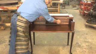
What is a Spiral Leg in Interior Design?
Spiral legs are rounded and twisted pieces of wood that add decorative detail to furniture. A spiral leg is usually crafted from a single piece of wood, with the grain running along the length of the leg as it’s carved into a twist or spiral shape.
This type of leg adds an interesting visual element to accentuate any design style and is often seen in antique furniture pieces or in contemporary designs with a more rustic feel. It can also be used to give an item of furniture extra stability, as the weight of the leg helps to keep it in place. Spiral legs can be found on:
- chairs,
- tables,
- dressers,
- cabinets and other types of furniture.
They are relatively easy to craft, making them a popular choice for DIY enthusiasts and professional woodworkers alike. With the right tools, anyone can create a custom spiral leg to give their furniture an extra touch of character.
Overall, spiral legs are an excellent way to add visual interest and stability to any piece of furniture. With their unique shape and texture, they are sure to make any interior design stand out. Whether it’s an antique or a contemporary piece, adding a spiral leg will surely give it the perfect finishing touch.
What are curved furniture legs called?
Curved furniture legs are often called Cabriole Legs. Cabriole legs feature a distinct curved shape that is designed to resemble an animal’s leg and can be seen frequently in traditional furniture pieces. They usually feature two outward curves, with the upper curve being more pronounced than the lower one. The curves of a cabriole leg also feature decorative carvings that add a unique aesthetic to any piece of furniture. Cabriole legs are often made from strong and durable materials such as mahogany, walnut or oak, giving them great strength and stability.
They are a popular choice for many types of furniture items due to their attractive shape and timeless style.
What style is spindle legs?
Spindle legs are furniture legs that look like round sticks. They are usually made of hardwood and come in different sizes and shapes. Spindle legs have been around for hundreds of years and more people like them now.
Spindle legs look nice on traditional, rustic and mid-century modern furniture. You can paint or stain them so they match your home’s style. They are a good choice for all kinds of furniture.
What are Sabre’s legs?
Sabre Legs are a type of furniture leg that features a curved shape and an ornamental design. They were first used in the 18th century and have become increasingly popular due to their elegant, graceful lines. Sabre’s legs usually feature outwardly curving curves at the top and bottom, with a decorative carving running along the length of each curve. They are usually made from strong, hardwood materials such as mahogany or walnut to give them extra stability and durability. Sabre legs can be painted or stained to match any type of decor and are a popular choice for accent chairs and other types of furniture.
What is a cup-turned leg?
A cup-turned leg is a type of furniture leg that has been crafted into the shape of a cup by turning it on a lathe. This type of leg typically features a round, tapered shape with decorative grooves running along its length. Cup-turned legs are usually made from hardwood materials such as mahogany or oak, giving them extra strength and stability. They are often used in traditional style furniture pieces, as well as more modern designs with a retro feel. Cup-turned legs can be painted or stained to match any type of decor, making them a versatile choice for any piece of furniture.
Related Links
Vintage Spiral Leg Side Table – Ebth
These Are 9 Examples Of Antique Furniture Leg Styles
“Lane” Checkers Backgammon Spiral Leg Game Table – Loveseat Vintage Furniture San Diego
Dos Gallos Custom Walnut Barley Twist Spiral Leg Dining Table
Know Your Furniture Leg Styles
Related Videos
What is Spiral Turning in Interior Design?
Spiral turning is a unique method of woodworking that allows a designer to incorporate intricate details into the construction of furniture and other wood pieces. This technique involves cutting, gluing, and twisting wooden strips together in such a way that they form a column with twisted strands or filaments resembling a rope. Depending on the desired effect, these spirals can be either left plain or embellished with decorative elements such as beads, inlays, and carvings.
What is Spiral Turning used for?
Spiral turning is often used to add visual interest to furniture pieces and architectural designs. It’s a great way to bring texture and depth into the space without overcomplicating it. With careful planning and execution, spiral turning can be used to create stunning pieces that are sure to be the focal point of any room.
Things to consider
When using spiral turning in interior design, the designer must consider several factors.
- The size and number of twists affect how prominent the feature will be in a room.
- Additionally, it is important to make sure that the twist pattern creates a balanced look within the overall design.
- Finally, the material used for spiral turning should complement other elements found in the room.
- With careful planning and execution, spiral turning can be used to create stunning furniture pieces and architectural designs.
Advantages of Spiral Turning
Spiral turning is a great way to add visual interest and complexity to a space.
- It creates unique designs that are sure to be the focal point of any room.
- Additionally, it can also help add texture and depth without overcomplicating the design.
- Finally, it allows for creative expression as each twist pattern can be customized according to the designer’s vision.
- Spiral turning is a great way to express creativity and bring unique character into any room.
- With careful planning, it can be used to create stunning furniture pieces and architectural designs that will be sure to draw the eye of anyone who enters the space.
Disadvantages of Spiral Turning
- Spiral turning requires a great deal of skill and precision to ensure that the twist patterns are even and balanced.
- Additionally, it can be difficult to make sure the feature stands out in the overall design without overpowering other elements in the room.
- Finally, when using materials such as metal or stone for spiral turning, may be more expensive than wood.
Conclusion
In conclusion, spiral turning is a great way to incorporate unique and intricate details into furniture pieces and architectural designs. With careful planning and execution, it can be used to create stunning features that bring visual interest and character into the space.
Related Links
Spiral Vessel- Turned And Carved: 6 Steps (With Pictures)
Turning Spirals On The Lathe
The Basics Of Turning Spirals – Spiral Woodturning Books
Spiral Layout Three Ways
Related Videos

What is Spiral Wave in Interior Design?
Spiral Wave in interior design is a design concept that is used to create flowing, dynamic movement and direct the eye throughout the space.
What is Spiral Wave used for?
It can be used to add texture and depth to an otherwise dull or static environment, while also creating a sense of energy and dynamism. Spiral wave designs typically use repeated curved lines or spirals to draw the eye in and out of space. This can be done by adding curved lines to the walls, floors, furniture, textiles, or artwork. It is also possible to incorporate this design concept into architectural elements such as:
- ceiling beams,
- columns, or doorways.
Spiral wave interior design is usually used with modern styles like minimalism. But it can also be used in other styles too. You need to think carefully about where the curved lines and spirals go so they look good. They can make a room more special and fun, like a surprise. But don’t use too many or it will not look good.
Advantages of Spiral Wave
- Spiral wave designs can be an effective way to add movement and energy to a space.
- They can also help create an interesting focal point and provide visual interest to a room that might otherwise be dull or static.
- Additionally, this concept is relatively easy to incorporate into any interior design style.
- When used properly, spiral waves can bring depth and texture to a space, making it more inviting and welcoming.
Disadvantages of Spiral Wave
- When not used correctly, spiral wave designs can be overwhelming or disorienting.
- This concept requires careful planning and consideration, as the curved lines and spirals should flow in harmony with the other elements of the design.
- Additionally, this type of design can be expensive to incorporate into a space, as it often requires custom carpentry or modifications.
- Finally, it is important to consider the lighting of the room when incorporating spiral waves, as the curved lines may not be visible in low light.
- Overall, Spiral Wave design is a great way to add movement and energy to an interior space.
When used correctly, it can be a beautiful and unique addition to any style of interior design. However, it is important to consider the advantages and disadvantages carefully before incorporating this concept into your home. With the right planning and consideration, spiral wave designs can create an inviting, dynamic atmosphere that will draw people in.
Related Links
Clipart Of a Blue Water Drop And Spiral Wave Design
Metal Stamping Tools Spiral Wave Metal Design Stamp
Industrial Barbell Spiral Wave Design Surgical Steel – Yo38521-1
Spiral Wave
Spiral Wave
What is a Spiral Welt in Interior Design?
Spiral welt is a decorative trim that has been used in interior design for centuries. It features one or multiple colors arranged in a spiral pattern, creating an eye-catching and distinctive look.
What is a Spiral Welt used for?
This welting trim is often used to add texture and interest to furniture pieces, window treatments, upholstery, and other home decor items. When applied tastefully, spiral welt can add a touch of luxury to any space. It is also relatively easy to install and can be matched with other bold patterns or colors. With its sophisticated design and impressive range of applications, spiral welt has become a popular choice in interior decoration.
Why is a Spiral Welt so popular?
No matter what your style may be, the spiral welt is an effective way to add personality and depth to any room. Not only is it aesthetically pleasing, but it also provides a practical solution for making a space look more sophisticated. With its timeless design and variety of colors, the spiral welt is an excellent choice for anyone looking to spruce up their home décor.
Advantages of a Spiral Welt
- The main advantage of the spiral welt is its durability.
- It can withstand everyday wear and tear, making it an ideal choice for high-traffic areas or households with children or pets.
- Additionally, since this welting trim can come in a variety of colors, you can easily find one that matches your existing décor.
Disadvantages of a Spiral Welt
Spiral welt does come with some drawbacks, however.
- It can be more expensive than other welting trims, and it can also be difficult to clean if it gets stained or dirtied.
- Additionally, due to its intricate design, the spiral welt may require two people for installation and should only be handled by professionals.
Conclusion
Whether you’re looking to add a touch of luxury to your living room, or simply want to make your windows more attractive, the spiral welt is an excellent choice. It’s vibrant colors and intricate patterns make it the perfect choice for any interior design project. So if you’re looking to take your home décor up a notch, consider adding some spiral welting trim today!
Related Links
Swing It Lumbar
Welt & Trim Products – Page 1 – J & J Auto Fabrics, Inc.
Custom Options
Related Videos
What is a Splat in Interior Design?
In interior design, a splat is a flat, vertical piece in the middle of an open chair back. Splats are often elaborately carved or ornamented with designs such as foliage, cresting waves, and other motifs. They are found in both antique and modern chairs and add visual interest to any space. The most traditional style of splat is the ‘horseshoe’, which consists of a curved slat at the top and bottom with a flat, vertical piece in the middle. This classic design looks great in any interior and can easily be incorporated into a variety of decor styles.
Splats are not only aesthetically pleasing, but they also provide structural support to chairs. By reinforcing the chair back, splats help to prevent them from sagging or becoming misshapen over time. They also reduce stress on the joints between the legs and the seat of the chair by providing additional stability. Splats are a great way to add a touch of sophistication and timelessness to any room. Whether used in traditional or modern settings, they are sure to add an elegant and stylish touch.
What is a splat in a chair?
A splat is a flat, vertical piece in the middle of an open chair back that is often carved or ornamented. The purpose of splats on chairs is to provide support and stability, as well as to add aesthetic appeal. Splats are found both in antique and modern chairs and come in various shapes such as horseshoes, foliage, and cresting waves. They can be used to add a touch of sophistication and timelessness to any home decor.
What is a stile in a chair?
A stile is a vertical support piece in a chair. It can be found on the legs, seat, arms, or back of the chair and serves to strengthen the structure and stability of the chair. Stiles are often decorated with carvings or other ornamentation to add aesthetic appeal. Stiles are commonly used in antiques as well as modern chairs and can be used to create a beautiful and timeless look.
What is the difference between a splat and a stile?
- The main difference between a splat and a stile is that a splat is found in the middle of an open chair back, whereas a stile is found on any vertical support piece of the chair.
- Splats are usually carved or ornamented for aesthetic appeal whereas stiles can either be plain or ornate.
- Additionally, a splat provides structural support to chairs whereas a stile helps to strengthen the structure and stability of the chair.
What is a side mark in design?
A side mark in design is a narrow, vertical strip of accent material or color that runs along the sides of an object. It can be used to distinguish one piece from another, create contrast or add visual interest. Side marks are commonly used in furniture and interior design, but they can also be found in graphic designs and web layouts. They are a great way to add a modern and stylish touch to any room or project.
Related Links
Splat (Furniture)
American Signature Furniture – We Make Furniture Shopping Easy
Magnolia Manor Upholstered Splat-Back Arm Chair – Woodstock Furniture & Mattress
Winslow Splat Two-Tone Side Chair Shopping
What is a Splint Seat in Interior Design?
A splint seat is a traditional furnishing technique used in country furniture during the 18th century. This type of seat was created by interlacing strips of oak or hickory to create a sturdy base for seating. Its unique design and construction offer durability, as well as an interesting visual texture that can be used to enhance any interior space.
What is a Splint Seat used for?
Splint seats can be used in a variety of ways, including seating for dining rooms and living areas. They can also be used as accent pieces placed against walls or in entryways, adding an interesting texture to the home that can help bring out other elements of the design. For those looking to add a unique historical touch to their décor, splint seats are an ideal choice. They can also be restored and refinished to suit any modern design style, making them a timeless option for many interior designs.
Today, splint seats remain popular among furniture enthusiasts and those looking to add a touch of history and texture to their homes. From country-style kitchens to contemporary living rooms, splint seats can be used to create interesting and unique seating areas. With its durable construction and timeless charm, a splint seat is sure to become a treasured addition in any home.
Overall, the splint seat is an ideal choice for those looking for a unique furnishing option with historical flair. Its unique design and construction make it a durable and timeless choice for any interior design. With its unique texture and charm, the splint seat is sure to add beauty and comfort to any home.
What is a splint bottom chair?
A splint bottom chair is a type of chair that utilizes the same weaving technique as a traditional splint seat. This involves interweaving strips of wood, such as oak or hickory, to create a sturdy base for seating. The result is an attractive and comfortable chair with historical charm and character. Splint bottom chairs have been used for centuries and are often used to add a unique touch to any interior décor.
What are the different types of chair caning?
Chair caning is a traditional technique for creating woven seating for chairs and other furniture. It involves weaving strips of material, usually rattan or rush, tightly together to form an attractive pattern on the chair’s seat. Chair caning has been practiced since the late 17th century and is still popular today, with many variations in style and design.
What are woven chair seats called?
Woven chair seats are typically referred to as splint seats, due to the weaving technique used in their construction. This technique involves interweaving strips of wood, such as oak or hickory, to create a sturdy and attractive pattern on the seat. Splint seats have been used for centuries and remain popular today, thanks to their unique visual texture and timeless charm.
What are the benefits of a splint seat?
A splint seat offers many benefits to interior design, including durability, a unique visual texture, and historical flair. Its construction technique offers greater strength than other types of seating, making it an ideal choice for both indoor and outdoor settings. Additionally, its unique woven pattern adds visual interest and character to any room, making it a timeless choice for many interior designs. Overall, the splint seat is an ideal choice for those looking to add a touch of history and texture to their home décor.
Cane and rush seating
They are also popular options for woven chair seats. Cane seating is made from thin strips of wood, typically rattan, which are woven together to create an attractive pattern on the seat. Rush seating uses thicker strands of plant material such as seagrass or reeds and is usually used in country-style furniture designs. Although both cane and rush seating offers a unique visual texture, rush seating is generally stronger and more durable than cane.
Related Links
Splint Seat Weaving Kit With Materials To-Redo Re-Weave A
Ash Splint – Seatweaving Suppliesseatweaving Supplies
Antique Nineteenth Century American Slat Back Woven Splint Seat Side Chair~Euc
Seatweaving #101 — Caning, Rush, Splint, Cord
Related Videos
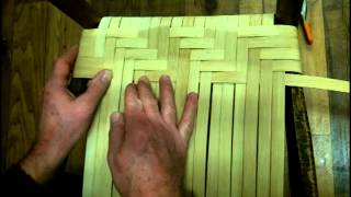
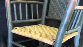
What is Split Leather in Interior Design?
In interior design, split leather is a type of material that has been created out of the bottom layers of a hide. The hide is first split into two parts, with the top-grain portion used to make full-grain leather, while the bottom layer is buffed and treated to create what we know today as split leather.
Split leather can be dyed, pigmented, or used to create a variety of looks and textures that make it an excellent choice for upholstery and other interior design applications.
What is Split Leather used for?
Split leather is also versatile enough to be used in luxury items like handbags and wallets. Its durability and affordability make it ideal for high-traffic areas like lobbies and entryways as well. Split leather is a great way to add style and comfort to any room.
What is the difference between leather and split leather?
- The main difference between leather and split leather is that full-grain leather has not been buffed or treated, while split leather has gone through a process of buffing and treatment to create a distinctive look and feel.
- Full-grain leather will also be more expensive due to its higher quality, whereas split leather can be produced for less money.
- Additionally, full-grain leather is more durable and lasts longer than split leather.
What material is split leather?
Split leather is made from the bottom layers of the hide, which have been split from the top-grain leather and then pigmented or sueded. It is a popular material for upholstery, handbags, wallets, and luxury items due to its durability and affordability. Split leather is also a great way to add style and comfort to any interior design project.
What is the best way to care for split leather?
Split leather should be cleaned regularly with a soft, damp cloth and gentle cleansers. It is important to avoid harsh cleaners or abrasives, as this can damage the surface of the material. To keep split leather looking its best, it should also be conditioned every few months with a leather conditioner. This will help to keep the material soft and supple, as well as protect it from damage.
What is split leather on furniture?
Split leather on furniture is a type of material that has been created out of the bottom layers of a hide. The hide is first split into two parts, with the top-grain portion used to make full-grain leather and the bottom layer being buffed and treated to create what we know today as split leather.
What are the advantages of using split leather?
- Split leather has many advantages over full-grain leather.
- It is more affordable and can be used in a variety of projects like handbags, wallets, luxury items, and upholstery.
- Additionally, it is very durable and hardwearing – perfect for high-traffic areas like lobbies or entryways.
Full grain leather
Split leather also offers a wide range of textures and colors that can add style and comfort to any room or project. Overall, split leather is an excellent option for interior design projects due to its affordability, durability, and versatility.
Conclusion
In conclusion, split leather is an ideal material for interior design projects due to its affordability, durability, and versatility. It can be used in a variety of applications ranging from upholstery to handbags and wallets, making it an excellent choice for any project. With its wide range of textures and colors, split leather can add style and comfort to any room.
Related Links
Split Leather – Www.Leather-Dictionary.com – The Leather Dictionary
Full Grain Leather vs. Genuine Leather – Diloro Leather
What Is Split Leather?
Split Leather, How Different From Genuine Leather? – Bike Forums
Related Videos


What is a Split Queen Box in Interior Design?
Split Queen box in interior design is a unique way to finish the look of an interior space. The split queen box consists of two queen size foundation units that measure 30″x80″ each, designed to accommodate the passage of a single-piece foundation.
This system allows for different mattress sizes to be placed side by side, allowing for more sleeping space without taking up more floor space. Split queen box is a perfect solution for those who need extra sleeping space in their home and don’t want to sacrifice style or comfort. It also gives the room a stylish, modern appeal that can be used as an accent wall or feature piece. With its sleek lines and eye-catching design, the split queen box is sure to make any room look and feel more interesting. It can also be used in a variety of settings, from bedrooms to living rooms and even corporate offices, adding that touch of style that will fit into any design scheme. Split queen box is the perfect way to maximize space without sacrificing style or comfort!
With the split queen box, interior designers can create a stunning look for any space. This system allows for an eye-catching design that will bring attention to any room or space. Whether used as an accent wall or feature piece, the design is sure to draw in attention and be the star of the show! The sleek lines and eye-catching design also make it a great choice for any type of space, from bedrooms to corporate offices. Split queen box is the perfect way to maximize style and comfort in any setting!
Diy split queen box spring
Diy split queen box spring for interior design can be an easy and budget-friendly way to achieve the aesthetic you want. With the right materials and instructions, you can complete this project easily on your own. This is a great solution for those who want to achieve a specific look in their home without breaking the bank. With DIY split queen box spring, interior designers can create a stylish and unique look that is sure to draw attention. This budget-friendly solution allows for endless possibilities when it comes to interior design, making it a great choice for those looking to spruce up their space without breaking the bank.
Homemade box spring full
Homemade box spring full for interior design can be a great way to create a unique look in any space. With just a few materials and instructions, you can complete this project easily on your own. This is an excellent solution for those who want to achieve a specific look without breaking the bank.
Construction of a box spring
It can be customized to fit any size mattress. This allows for more flexibility when it comes to interior design, as the box spring can be tailored to suit the specific needs of a room or space. With homemade box spring full, interior designers can create a stylish and unique look that will draw attention to any room or space. This is the perfect solution for those looking to spruce up their home without breaking the bank!
Related Links
Boxes, Split Queen Box
Top 7 Best Split Queen Box Springs
Used Queen Size Mattress Split Queen Box Spring, Frame For Sale In Ames – Letgo
Split Queen Box Foundations
What is a Split-Back Sofa in Interior Design?
A Split-back Sofa is a popular style of sofa that has become increasingly popular in modern interior design. The distinguishing feature of this type of sofa is the vertically seamed indentations that run up the back, usually dividing the surface into three. This distinctive detail creates an eye-catching and stylish look that can add visual interest to any room.
Split-back sofas are often upholstered in neutral colors and fabrics, making them an ideal choice for adding a touch of sophistication to any room without overwhelming the space. Additionally, these sofas can be paired with colorful throws and pillows to create a unique look that is sure to impress. When it comes to interior design, a Split-back Sofa is the perfect way to add distinctive style and elegance.
Advantages of a Split-Back Sofa
A Split-back Sofa is a great way to add style to any room.
- These sofas offer an easy and affordable way to update the look of any space while remaining comfortable and durable.
- Additionally, these sofas come in a variety of material choices, making them perfect for anyone looking to find the right sofa for their home.
- Split-back sofas are also easy to clean, making them ideal for busy households and those who appreciate low-maintenance furniture.
- Finally, these stylish sofas offer a comfortable seating solution that is sure to be enjoyed by everyone in the family.
Disadvantages of a Split-Back Sofa
- Although Split-back sofas can be a great addition to any room, there are some potential drawbacks to consider.
- Due to their design, these sofas may not offer as much seating space as other types of furniture.
- Additionally, the vertical indentations in the back of the sofa may not be suitable for all homes.
- Finally, these sofas can be more expensive than other types of furniture due to their unique design details.
What is a loose cushion sofa?
Loose cushion sofas are a type of furniture that features seating cushions that are not firmly attached to the sofa frame. The cushions can be easily moved around, making them great for creating custom shapes and configurations in any room. Additionally, these types of sofas often come with removable covers, allowing you to easily switch up the look of your space. Loose cushion sofas are comfortable, versatile, and perfect for anyone who likes to switch up the style of their home on a regular basis.
Related Links
Innovaton Living Splitback Sofa Bed
Splitback Sofa Bed With Armrests
Split Back Sofas
Split Back Sofas & Couches – Living Room Furniture Online
Related Videos
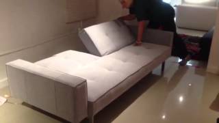
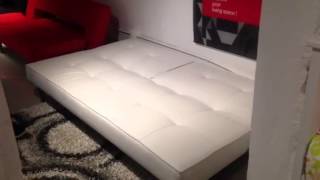
What is a Spool Bead in Interior Design?
A spool bead is a type of interior design element typically found in traditional or vintage-style interiors. This decorative feature consists of a continuous turning having the form of a series of connected beads, usually made from wood.
What is a Spool Bead used for?
- It can be used to frame door and window openings, create half-walls, divide rooms, and define spaces.
- Spool beads can also be used to add texture and interest to walls, cabinets, furniture pieces, and more.
- Adding this decorative trim is an easy way to enhance a room with a touch of classic style.
- Spool beads are available in various styles, materials, and finishes so they can easily be tailored to any design aesthetic.
- Regardless of the application, spool beads provide a unique, eye-catching, and timeless look.
What are some advantages of using Spool Beads?
- Spool beads are affordable, easy to install, and can be used in a variety of creative ways.
- They also provide visual interest without overwhelming a space, adding contrast and texture to an interior.
- Additionally, they add a timeless charm that will enhance any room.
Overall, spool beads are an attractive, practical and cost-effective way to add a bit of classic style to any interior space. Whether it’s used as a door or window frame, half-wall divider or wall feature, this decorative trim will lend an elegant touch that won’t go unnoticed.
What are some disadvantages of using Spool Beads?
- The main disadvantage of spool beads is that they can be difficult to paint.
- The nature of the material means that it can soak up a lot of paint and require multiple coats for full coverage.
- In addition, because of its intricate design, painting around the beads can be time-consuming and challenging.
- Finally, some people may find the design of spool beads too busy or overwhelming, while others may view it as outdated.
Despite these potential drawbacks, spool beads remain a popular decorative element due to their timeless charm and elegance. It’s important to consider your own personal preferences when deciding if spool beads are right for you.
Related Links
Turning Beads With a Skew Chisel – Finewoodworking
Wood Turning Shapes-Spool 3/4″X5/8″ 12/Pk – Joann
Ko Nylon Japanese Beading Thread 55 Yd Spool – White – Artbeads
Buy The 1″ Wood Spools By Artminds™ At Michaels
Related Videos
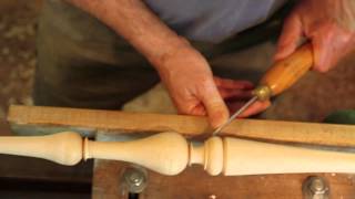
What is a Spoon Back (or Spooning) in Interior Design?
Spoon back is a popular form of upholstery, made by applying and shaping fabric over the frame of a chair or sofa. It’s characterized by the “spoon” shape at the top of the back piece and provides an interesting visual contrast to other pieces in a room.
What is a Spoon Back used for?
This style dates back to Victorian times and was used to add a personal touch of comfort and style to furniture. By giving the chair or sofa shape, spoon-back upholstery creates interest within the room. It can also act as a focal point, pulling together the overall design of a space.
What is the fabric used for spoon back?
The fabric used for spoon back upholstery is usually chosen based on its durability, color preference, and interior design scheme. The trick is to find a fabric that ties in with the color scheme, yet stands out enough to add an interesting flair.
Choosing fabrics like velvet, linen or damask can also add texture and style to the look. Designers need to pay special attention when working with spoon back upholstered pieces. The details are what make this particular style stand out, and well-crafted pieces require the right fabric, shape and craftsmanship.
Ultimately, spoon back upholstery can be a great addition to any interior design scheme that requires an extra bit of personality or visual interest. It’s classic yet modern enough to not only add charm but also bring new life to any room. Plus, it’s sure to draw attention, making it the perfect focal point for your interior design project.
Advantages of a Spoon Back
- The main advantage of having a spoon-back upholstered piece is that it offers extra comfort.
- It is designed with support in the areas where your body needs it most, so you can sit or lay back and relax for hours on end.
- Plus, its unique shape adds visual interest to any room, creating an inviting atmosphere that encourages conversation.
In addition to comfort and style, spoon back upholstery is also extremely durable. Its shape ensures that the fabric remains in place, no matter how often it’s used. This means you can enjoy your piece for years to come without worrying about having to replace it too soon.
Disadvantages of a Spoon Back
The main disadvantage of having a spoon-back upholstered piece is that it can be more expensive than other types of upholstery. This is because the shape and design require extra fabric, as well as more intricate craftsmanship.
In addition, some people may find the style to be too ornate or traditional for their tastes. If you’re looking for something more modern, then a spoon back upholstered piece may not be the best choice.
Related Links
20060328Spoon Back Chairs – Kitchens Design, Ideas And Renovation
How To Spoon: Big, Little Or Both?
Spooning – Chair Spooning.
20010201Spoon Back Chair – Kitchens Design, Ideas And Renovation
What is Spring Down in Interior Design?
Spring Down is a type of cushion used in interior design that combines the classic comfort of down feathers with the modern convenience of coil springs. The coil springs are wrapped in polyurethane and covered with down batting, giving them durability while still providing softness and support.
What is Spring Down used for?
This construction provides a cushion that is both comfortable and long-lasting, which makes it ideal for any area of the home. From sofas and chairs to beds and headboards, Spring Down cushions can be used in a variety of applications. They are also perfect for creating a luxurious feel in high-traffic spaces like entryways and hallways. When combined with elegant fabrics or plush textures, Spring Down can instantly elevate any room. And because they are designed to last, they can be used for years without showing signs of wear and tear. With the right care and maintenance, Spring Down cushions will remain comfortable and hospitable for many years to come.
For those looking for a unique take on cushion design, Spring Down is an excellent choice. With its combination of classic comfort and modern convenience, it is the perfect choice for any home or office space. Whether it is used as a focal point in a living room or as an accent piece in a bedroom, Spring Down can bring charm and sophistication to any setting. Its versatile design also allows it to be used with both traditional and contemporary decor. So if you are looking for a cushion that can provide comfort and style, Spring Down is a perfect choice.
Overall, Spring Down is an ideal option for interior design projects of all kinds. With its combination of spring support and down feathers, it offers superior comfort and longevity. And because it can be used with both traditional and modern decor, it is a versatile choice for any space. Whether you are looking to upgrade an existing room or create a unique look from scratch, Spring Down can be the perfect addition to your project. With its combination of comfort and convenience, Spring Down is sure to make your interior design dreams come true.
What are the 3 F’s in interior design?
Interior design has 3 F’s: form, function, and feeling. Form is how the space looks – colors, shapes, and sizes. Function is what activities happen in the room and how they affect it. Feeling are emotions that a space can make you feel like cozy or awe-inspiring. When all three of these things are balanced together in a room, it will look beautiful.
What is the 2 3 rule in interior design?
The 2/3 rule in interior design is a guideline used to create visually pleasing and balanced spaces. According to the rule, two-thirds of a room should be covered by large furniture pieces such as sofas, beds, or tables while one third should be left open for movement. This helps ensure that the space doesn’t feel cluttered or overwhelmed by too much furniture, which can make it seem smaller and less inviting. In addition, the two-thirds of the room that are covered with furniture should be balanced in terms of size, color, texture, and shape for a more aesthetically pleasing effect.
What is a spring sofa?
Spring sofa is a type of cushion constructed of coil springs, which are wrapped in polyurethane and covered with down batting. This construction provides a cushion that is both comfortable and long-lasting, making it ideal for any area of the home. Spring sofas are perfect for creating a luxurious feel in high-traffic spaces like entryways and hallways, and they can also be used in a variety of applications from living rooms to bedrooms. With its combination of classic comfort and modern convenience, it is the perfect choice for any home or office space.
How can you tell if a sofa is of good quality?
When looking for a good quality sofa, check the materials it is made from, look at the cushions and springs, and inspect the frame.
- It should have a sturdy frame made from hardwood with mortise-and-tenon joinery or dowel construction for maximum stability.
- The cushions should be filled with high-quality foam or down and feathers, while the springs should be heavy gauge steel or tempered steel to ensure durability.
- It is also important that the fabric used is high quality and made to last.
- Finally, always check for a manufacturer’s warranty – this will give you peace of mind that your investment in good quality furniture is protected.
Related Links
Spoon Back Upholstered Dining Chair (Arm) Qj492789Acwalf001
Upholstered Spoon Back Chair – Chairs
Spoon Back Chair
Spoon Back Occasional Chair – Traditional Transitional Dining Chairs – Dering Hall
Related Videos
What are Springs in Interior Design?
Springs are components used in interior design to provide support and cushioning for upholstered furniture. They play a major role in helping the furniture maintain its shape and look, while also providing comfort to sit on or lie down on.
Types of springs
The two most commonly used types of springs for upholstered furniture are coil springs and sinuous springs.
- Coil springs are individually mounted in leather or cloth pockets and spaced out evenly across the furniture’s frame to create even support throughout the piece.
- Sinuous springs are more flexible than coil springs, with S-shaped wires running from one side of the frame to the other. These provide a greater amount of flex and cushioning while still providing adequate support.
Coil and sinuous springs are important parts of furniture. They help to make the furniture comfortable, look nice, and last for a long time. Think about this when choosing furniture for any space.
What are their Benefits?
Springs play an important role in interior design, offering both aesthetic and functional advantages.
- They provide support to the upholstered furniture, helping it maintain its shape over time while also providing comfortable cushioning.
- Coil springs are known for their ability to evenly distribute weight across the entire piece of furniture, while sinuous springs are ideal for providing an even greater degree of flexibility and cushioning.
- This makes them perfect for furniture pieces that should be comfortable but also provide a great deal of support, such as sofas or lounge chairs.
- Springs also allow designers to create unique looks through their choice of fabric and patterns, giving the piece more character and making it stand out in the space.
Disadvantages of Springs
While springs are great components to use in interior design, they can also have some drawbacks.
One of the most common issues with springs is that they can occasionally become loose or broken over time, which may cause the furniture to become uncomfortable and sag.
It is important to regularly check for any signs of wear and tear on the springs, as this could indicate that they need to be replaced or adjusted.
In addition, the cost of replacing springs can be quite high, so it is important to consider whether it is worth it before making such an investment.
Conclusion
Springs are crucial components in interior design, offering both aesthetic and functional advantages. Coil and sinuous springs are the most commonly used types of springs, providing support and cushioning to upholstered furniture pieces. Although there can be some drawbacks to using them, such as the possibility of wear and tear or high replacement costs, they are still a worthwhile investment for any interior design project.
Related Links
Upholstery Coil Springs
What Are The Three Types Of Upholstery Springs? – Doityourself.com
Types Of Couch Springs – Home Guides
Upholstery Springs And Furniture Springs
Related Videos


What is Squab Cushion in Interior Design?
Squab cushion is commonly used in interior design to provide comfort and support while sitting. It is a loose flat cushion that is placed on the seat of a chair or other furniture, such as a sofa or bench. Squab cushions are often filled with foam, feathers, down, or other materials for added softness and support.
What is Squab Cushion used for?
They can also be covered with a variety of fabrics, such as velvet, cotton, leather, or even faux fur. The fabric used to cover a squab cushion should match the color scheme and style of the room it is in. Squab cushions are not only attractive additions to any space but they also provide comfort while allowing easy movement and flexibility. A squab cushion can be a great way to soften the look of a room and make it more inviting for guests.
The use of squab cushions in interior design is an effective way to enhance the comfort, style, and aesthetic of any space. They provide not only physical comfort but also a sense of luxury that can help to tie a room together. Adding a squab cushion to the seating in any space can make it much more inviting and comfortable for guests. With so many stylish options available, they are an easy way to add style and comfort to any home or office.
Squab cushions are becoming increasingly popular in interior design due to their versatility and ability to blend in with any style. They can be used in traditional, modern, or eclectic interiors and can easily be customized with a variety of colors, fabrics, and patterns. If you are looking for an easy way to add comfort and style to your space, consider adding a squab cushion!
What is a squab in furniture?
A squab is a type of small, upholstered seat or cushion that is commonly used in the interior design industry. Generally, it is placed on a chair or other piece of furniture such as a sofa or bench and often filled with foam, feathers, down, or other materials for added comfort. Squabs are typically covered with fabric such as velvet, cotton, leather, or even faux fur and come in a variety of colors and styles to fit any décor. Squabs are an effective way to enhance the look and comfort of any space while providing an inviting atmosphere for guests. They can easily be customized with different colors, fabrics, and patterns making them a great option for any home or office.
In conclusion, squab cushions can be a great addition to any space. They are versatile and come in a variety of colors, fabrics, and patterns allowing them to easily fit into any décor.
What is a squab in New Zealand?
In New Zealand, a squab is traditionally a young pigeon or dove. It is also used to refer to a thick cushion or pillow placed on furniture such as chairs and sofas. Squabs are usually filled with either foam or feathers for added comfort and support and can be covered in any type of fabric for a decorative effect. They are a popular addition to any space, adding comfort and style to the overall look of a room.
Related Links
Squab Cushions Give Added Comfort To Hard Chairs.
What Is The Difference Between Squab And Cushion? – Wikidiff
The Traditional Squab Cushion With Armand Verdier Tickets, Thu 16 Aug 2018 At 09:30 – Eventbrite
Introduction To Stitching Squab Pads
Related Videos
What is a Square Leg in Interior Design?
The square leg is a popular interior design detail that is used to provide support for furniture, such as coffee tables and dining tables. The legs feature four sides of equal dimensions that resemble a fence post, providing an angular and contemporary look. Square leg furniture can be found in many homes and commercial settings, from modern lofts to traditional dining rooms. When choosing furniture with square legs, consider the look you want to create and the practical needs of your space. Square leg pieces can bring stability and support without adding visual clutter to a room. They also provide easy access for cleaning under furniture or rearranging the layout of a room.
Square leg furniture is often crafted from materials such as:
- metal,
- wood,
- plastic,
- or even stone.
What is Square Leg used for?
Whether used as an accent detail or as the main structure for furniture, square leg designs can add a modern touch to any interior space.
Square leg furniture is often crafted from materials such as:
- metal,
- wood,
- plastic,
- or even stone.
Depending on the material used and the style of the legs, they can be further customized with colors or finishes that match the overall design scheme of a room. For example, a black matte finish on metal legs can provide a contemporary look while a natural wood stain can create a more traditional vibe. No matter which style you choose, square-leg furniture is sure to elevate the design of your interior space.
Overall, square leg designs are versatile and durable additions to any home or commercial space. They bring an angular modern touch that can blend seamlessly with a variety of design styles, from traditional to contemporary. Square leg furniture has the potential to last for many years and provide reliable support for any piece of furniture in your home. When shopping for square leg pieces, consider factors such as:
- material,
- color,
- and style to create the perfect look for your interior space.
Advantages of a Square Leg
Square legs provide many advantages for interior design.
- They bring a modern, angular look without adding visual clutter.
- The equal dimensions on all four sides of the leg create stability and support for furniture pieces, providing reliable structure over time.
- Additionally, square leg designs can be customized to match any color or finish you desire.
These features make square leg an ideal choice for any home or commercial space.
Furthermore, square leg furniture provides easy access to cleaning under pieces and rearranging the layout of a room.
Overall, this type of furniture is both aesthetically pleasing and highly practical.
Conclusion
Square leg is an excellent interior design detail that can bring modern style to any home or commercial space. The angled shape of the legs is both aesthetically pleasing and highly practical, providing stability and support for furniture pieces without overcrowding a room. Square leg pieces can also be customized with colors or finishes to match any design scheme.
Related Links
Square Leg Table – A-America Wood Furniture
Square Furniture Parts – Tablelegs.com™ – Shop Online
Square Table Legs
Table Legs And Unfinished Wooden Furniture Legs – Shop Online
Related Videos
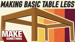
What is Staining in Interior Design?
Staining is a crucial step in the finishing process for wood furniture. It adds color and depth to furniture, giving it an attractive look and feel. Stains are applied by hand or with a spray gun and can give any piece of furniture a unique character and visual appeal. Depending on the desired effect, staining can range from subtle to dramatic.
What is Staining used for?
Staining furniture can give it a special look, like if it is old or worn. It is important to use the right kind of stain and put it on the furniture properly. If you do not do this, you will not be happy with how it looks. After staining has been applied, the next step is to apply a sealer or topcoat, which helps to protect the furniture and bring out its best features. When done correctly, staining can be an effective way to customize any piece of furniture and create a focal point in any interior space.
What is Square Leg in Interior Design?
The square leg is a popular interior design detail that is used to provide support for furniture, such as coffee tables and dining tables. The legs feature four sides of equal dimensions that resemble a fence post, providing an angular and contemporary look. Square-leg furniture can be found in many homes and commercial settings, from modern lofts to traditional dining rooms. When choosing furniture with square legs, consider the look you want to create and the practical needs of your space. Square leg pieces can bring stability and support without adding visual clutter to a room. Square-leg designs can help make your home look modern. They are also great for cleaning under furniture or changing the way a room looks. These designs can be used to accentuate your home or as the main structure of furniture.
Square leg furniture is often crafted from materials such as metal, wood, plastic, or even stone. Depending on the material used and the style of the legs, they can be further customized with colors or finishes that match the overall design scheme of a room. For example, a black
What is a stain in design?
Stain in design is a special type of finish or coloration applied to the surface of a material. It can be used to enhance the visual appearance and texture of an object, from furniture and walls to fabrics and carpets. Stain adds depth, color, and character to any material it is applied on. Stains come in different forms and consist of various types, including:
- oil-based,
- water-based,
- lacquer,
- shellac,
- and metal.
The type of stain you use can help protect your material from the sun, water damage, and other things. You can also use stains to make unique patterns or look like wood. Whatever you choose, it can add a special touch to your design project.
What is staining vs painting?
Paint and stain are both common finishes for interior design, but there are distinct differences between them.
- Paint is a thicker finish that covers the entirety of the material it is applied to; it can be used for an opaque look or a glossy finish.
- On the other hand, staining involves applying colorant to bring out the natural grain and patina of a material.
- Staining does not completely conceal the underlying material and is often used for accentuating wood grain or adding color to furniture, walls, floors, and more.
- Overall, painting provides greater coverage than staining, while staining brings out the best features of the material without obscuring it.
Is staining the same as finishing?
Staining and finishing are different things in interior design. Finishing means making something look better or last longer. It includes sealants and topcoats which make materials look better and last longer.
Related Links
Related Videos

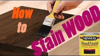

What is Steam Bend in Interior Design?
Steam bending is a method used by interior designers and woodworkers to bend single pieces of wood into furniture parts. This technique is often seen in chairs that have a curved seat or back, such as the bow-back chair or bow-splat chair designs.
What is Steam Bend used for?
It can also be used on other furniture components such as:
- headboards,
- footboards,
- and railings.
Steam bending involves using heat and moisture to make the wood more pliable, so it can be bent into curved shapes without breaking or splitting. First, the wood is heated with steam until it reaches a temperature that allows it to become flexible enough for bending. It is then placed in a jig or form which holds the shape until it cools and hardens.
Steam bending is an effective, economical way to produce furniture parts with curved shapes that would otherwise be difficult, or even impossible, to achieve using traditional woodworking techniques. This technique is also less labor-intensive than other methods of shaping wood such as lamination or carving. Because of its cost-effectiveness and ease of use, steam bending is often used in the production of furniture for both residential settings.
What is the benefit of steam bending?
- Steam bending is a great way to create uniquely shaped furniture pieces that can be difficult or impossible to make with other techniques.
- It also requires fewer tools and is less labor-intensive than some other methods of shaping wood, so it is an economical choice for furniture makers.
- Finally, steam bending produces highly durable furniture parts that are resistant to cracking and splitting over time.
How do you steam bend at home?
- Steam bending can be done at home with a few basic items like a steam box and a jig.
- To begin, cut the wood to size and shape it as desired. Place the piece in the steam box and fill it with enough water to create steam. Turn on the heat and let the wood sit for several hours until it becomes soft and pliable.
- Remove the wood from the steam box and place it in a jig to hold it in its desired shape while it cools. Once cooled, it will harden in the curved shape you have created.
Steam bending is a great way to create unique furniture pieces with curved shapes that would otherwise be difficult or even impossible to make. With a few simple tools and some patience, you can easily steam bend at home!
What is the difference between steam bending and bent lamination?
- Steam bending and bent lamination are two distinct techniques used in woodworking to achieve curved shapes.
- In steam bending, a single piece of wood is heated with steam until it becomes pliable enough for bending into the desired shape. Once cooled, it will harden in its new form without cracking or splitting.
- On the other hand, bent lamination uses layers of wood that are glued together and then bent into shape. This technique produces a stronger result with less risk of cracking or splitting than steam bending, but it is also more labor-intensive and requires specialized tools.
Related Links
How Not To Steam Bend Wood
Steam Bending – Wood Magazine
3 Easy Ways To Steam Bend Wood – Wikihow
Related Videos


What is Stenciling in Interior Design?
Stenciling is an interior design technique used to create patterns by covering an area of a surface and applying color to the uncovered space.
What is Stenciling used for?
It’s often used in bathrooms, bedrooms, and other home decor projects that require a creative touch. The traditional method involves cutting out shapes from cardstock or poster board and then using tape or glue to adhere the shapes to the surface. Once secure, paint is applied over the stenciled area and removed when dry to reveal a pattern or design that can be further enhanced with additional colors or techniques.
What is the purpose of stenciling?
Stenciling is a way to make designs on surfaces. You can use it to decorate walls, furniture, fabrics, and other things in your home. It is an inexpensive way to make your home special without getting help from someone else. With the right supplies, you can create beautiful designs that will last for a long time!
What are the benefits of stenciling?
- Stenciling is a great way to quickly and easily add decor to any space.
- Its affordability allows homeowners to customize their homes without breaking the budget.
- Stencils come in all shapes and sizes, so it’s easy to find one that will fit the project at hand.
- They also allow for more control when creating intricate patterns or replicating images, such as a favorite family photo.
- With the right supplies and creativity, anyone can create beautiful results that will last years!
What are some tips for successful stenciling?
To make sure the lines are neat, use painter’s tape or spray to hold down your stencil. Choose the right paint for the look you want. Chalk paint or spray paint can give a softer feel. Acrylics or fabric paints will be brighter. Put a thin layer of paint on and don’t put too much in one spot. When you’re done, clean off any extra paint and stencils!
What is the difference between stencil and stenciling?
Stencil is the template or pattern used to create the design, while stenciling is the act of using that template to apply paint or other mediums to a surface. Stencils can be cut out of cardstock and poster board, purchased online, or custom-made depending on the project at hand. Stenciling is an easy way for homeowners to add style and personality to their walls without hiring a professional artist or designer.
What are some popular stenciling techniques?
There are several popular stenciling techniques that can be used to transform a space. Brush stippling is a popular technique that uses a brush to add texture and depth to the design. Masking tape is another great option for creating clean lines and sharp edges around the stenciled area. Faux finishes, such as dragging or sponging, are also popular methods that can be used to add dimension and interest to the design. With the right supplies and creativity, anyone can create beautiful results quickly!
Related Links
Decorating Ideas For Stenciling Rustic, Outdoorsy Pieces
DIY Decorating Ideas Using Stencils
5 Outdoor Decorating Projects Using Stencils
Related Videos
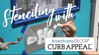
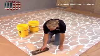
What is a Stereo Cabinet in Interior Design?
A stereo cabinet is a type of furniture that is designed specifically to house audio components. It typically comes with shelves and drawers, allowing the user to store their music collection, CDs, DVDs, and other media items in an organized fashion. The stereo cabinet may also include additional features such as speaker enclosures or even an amplifier, depending on its purpose. The stereo cabinet is an ideal way to keep your audio components neat and out of sight while allowing you to enjoy the full benefit of their sound quality.
Interior designers often recommend using a stereo cabinet in order to create an aesthetic look in any room, as well as keep your audio system organized. A stereo cabinet can also add an air of sophistication to any living space, being a great way to display your audio components in style.
Overall, a stereo cabinet is an essential piece of furniture for any home audio setup, allowing you to keep all your audio components in an organized and aesthetically pleasing manner. From giving a room an elegant look to keeping all your audio-related items neatly tucked away, the stereo cabinet is a great way to make sure that you enjoy the full benefit of your sound quality without having to worry about clutter.
What size is a stereo cabinet?
Stereo cabinets come in a variety of sizes, depending on the size of your audio components and how much space you have available.
- Generally speaking, stereo cabinets are usually between 20 to 36 inches wide, 12 to 24 inches deep, and 28 to 52 inches high.
- The exact size will depend on the type of audio components that you have and how many shelves and drawers are needed to hold them.
When purchasing a stereo cabinet, it is important to make sure that you have enough space to accommodate all of your audio components as well as other media items that you may need to store. Additionally, the furniture should be able to fit in with the overall décor of the room.
How deep should a media cabinet be?
Media cabinets are typically 12 to 24 inches deep, depending on the size of your audio components and how much space you have available. The exact depth needed for your media cabinet will depend on the type of audio equipment that is being stored as well as any other items such as CDs or DVDs that need to be housed in an organized fashion. When purchasing a media cabinet, make sure that you measure the space available carefully to ensure that the furniture will fit correctly. Additionally, it is important to consider additional features such as adjustable shelves or drawers when selecting your media cabinet in order to customize it to your specific audio setup.
What type of material should be used for a stereo cabinet?
- Stereo cabinets are usually made from durable materials such as wood or metal, ensuring that they can withstand the test of time and use.
- Wood is often a popular choice for stereo cabinets due to its classic look and natural feel. Additionally, wood may come in various finishes and colors so you can easily find one that matches your home’s décor.
Stereo furniture cabinets
Made from metal are also available, providing a modern look and feel. Metal cabinets tend to be more durable than wood and can withstand harsher environments such as humid or dusty areas.
When purchasing a stereo cabinet, it is important to select one that is of high quality since this will help ensure that your audio components remain safe and secure in their protective housing.
Also, the stereo cabinet should be able to fit in with the overall décor of the room and all of your audio equipment should comfortably be able to fit inside it.
Stereo cabinet ideas
When shopping for a stereo cabinet, there are many different styles and designs to choose from. Depending on your audio setup and the décor of the room, you can find one that is sure to fit in perfectly with your home’s style.
For instance, if you have a modern-looking media center, then a sleek metal cabinet may be the perfect option for you. On the other hand, if your room has a more traditional feel to it, then a wood cabinet could be the ideal choice for storing all of your audio components.
70s stereo cabinet
In addition to the many styles available, cabinets can also come in different shapes and sizes.
For example, if you have a lot of audio components and need extra storage, then an armoire-style cabinet may be the perfect choice for you. Alternatively, if space is limited in your home, then a compact unit may be more suitable.
No matter what size or style of stereo cabinet you choose, make sure that it is durable and able to withstand the test of time and use. This will ensure that your audio components remain safe and secure in their protective housing.
Related Links
Stereo Cabinet Furniture – Ideas On Foter
Stereo Cabinet – Crutchfield
Stereo Cabinet To Media Console – Refunk My Junk
32 Best Stereo Cabinet Images – Stereo Cabinet, Lp Storage, Vinyl Storage
Related Videos

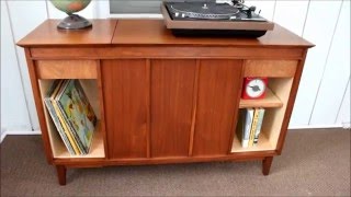
What is Stickley in Interior Design?
Gustav Stickley was a furniture designer and manufacturer who pioneered the American Arts and Crafts movement in the early 20th century. His designs, often referred to as “Mission style,” embody simple, straight lines with an emphasis on craftsmanship, comfort, and durability.
Stickley believed that good design should be accessible to all people regardless of their socioeconomic status, and his designs have since become an iconic part of American interior design.
Stickley furniture is still produced today and can be found in many homes across the country. Whether you’re a fan of the Arts and Crafts movement or are simply looking for timeless pieces that will last for years, Stickley furniture is a great choice. From couches and chairs to tables, dressers, and beds, Stickley offers a wide range of pieces that can fit almost any interior design style. Gustav Stickley designed furniture over 100 years ago. It looks nice and it will last a long time. Stickley furniture adds style and coziness to any home.
What type of furniture is Stickley?
Stickley designs and manufactures a variety of furniture pieces, ranging from classic mission-style chairs and sofas to modern dining tables and storage units. Stickley also offers bedroom sets, entertainment centers, desks, bookcases, outdoor items such as benches and swings, accessories like lamps and mirrors, as well as a range of customizable options.
How do you identify a Stickley?
- Stickley furniture is typically marked with a paper label or brand stamp that reads either “Gustav Stickley” or “The Craftsman Workshops.”
- The mark should also include the year and pattern number, along with a serial number to help identify the piece.
- Additionally, there are some unique features of Stickley furniture that can help you identify it.
- For example, many Stickley pieces feature exposed joinery such as dovetail joints and wedges, and often times the wood is left unfinished or lightly finished with a clear coat.
- Stickley puts special hardware on their furniture. This includes copper knobs, hinges with straps, and latches for the doors.
What quality is Stickley furniture?
Stickley furniture is very well made and looks nice. It is made by hand with special techniques. The materials used are strong like oak and cherry.
Related Links
Stickley Furniture
Stickley Furniture Collections
Stickley Chairs For Sale
What is a Straight-Back Sofa in Interior Design?
A Straight-Back Sofa is a classic and timeless style of sofa with a straight, narrow back, and arms that extend forward. Variations often include set-back arms for extra comfort and T-cushions for the seat. This style of a sofa works well in many different decorating schemes since it can easily be dressed up or down depending on the surrounding furniture and accessories. The straight-back design is a great choice for those who are looking for an understated but elegant look, as it will fit in with both modern and traditional interiors. Furthermore, this style of the sofa offers extra seating without taking up too much space in a room, making it perfect for smaller living areas. Whether your style is classic or contemporary, a Straight-Back Sofa can be the perfect addition to any interior design.
This type of sofa also offers comfort and versatility as it comes in various sizes and materials. Whether you prefer leather, velvet, or microfibre upholstery, there’s sure to be an option that fits your style and budget. In addition, the arms of the sofa can be customized to meet specific needs, such as adding armrests or making them thinner or wider. Whatever you decide, a Straight-Back Sofa is sure to add function and style to any interior space.
For those looking for an iconic sofa design with a timeless appeal, look no further than a Straight-Back Sofa. This classic yet modern sofa style can work in any interior and is sure to be an eye-catching addition to your home. With its many customization options and stylish design, it’s the perfect way to make your living space comfortable and inviting.
What are the different types of sofa backs?
The most common types of sofa backs are the rolled-back, Camelback, and straight-back.
- The rolled-back style is characterized by its rounded shape and often features tufting for added comfort.
- The Camelback style has a curved center line along the back with arms that extend outward and padded armrests.
- Finally, the straight-back style has a straight top and arms that extend forward with T-cushions on the seat.
Each of these styles offers its own unique design, making it easy to find one that works best for your living space.
How can I make my straight-back couch more comfortable?
- A straight-back couch is already quite comfortable, but you can make it even cozier by adding extra pillows or throws.
- Extra cushions and throw blankets will add an extra layer of comfort for you and your guests while also giving the room a decorative touch.
- Additionally, you can consider switching out the cushions for ones with more padding or even adding armrests for extra support.
There are many ways to customize your straight-back sofa to make it as comfortable as possible.
What is a standard back sofa?
A standard back sofa is usually an armless style featuring a straight top and arms that extend outward.
What is the difference between formal back and pillow-back sofas?
Formal back sofas feature a straight top and arms that extend outward. Pillow-back soas, on the other hand, have two or more large pillows along the back to provide extra comfort and support.
The pillow-backs tend to be softer and cozier than formal backs but are not as well suited for more structured and tailored decorating styles.
Pillow back couch
Styles are great for adding a casual, inviting atmosphere to any living space.
What is the best fabric for a straight-back sofa?
The best type of fabric for a straight-back sofa will depend on your personal preference and design aesthetic.
- Leather is a popular choice as it is easy to clean and maintain, while velvet or microfiber offers a softer and more inviting feel.
- Additionally, performance fabrics are great for those looking for stain resistance and durability.
What is the average price of a straight-back sofa?
The average cost of a straight-back sofa can vary greatly depending on the size, material, and upholstery. On average, you can expect to pay anywhere between $200 – $3000 for a quality straight-back sofa.
Related Links
Straight-Back Sofa
21 Different Types Of Sofas And Slipcoverability – What’s Mine?
Beautiful Home Decor, Beautifully Priced
Modern Sofa with Straight Back having Single Button Tufts
What is Strapwork in Interior Design?
Strapwork is an intricate and decorative form of wall ornamentation. It was developed from leather strap work used in armor, but it soon became popular for interior design, particularly during the Renaissance period.
What is Strapwork used for?
The use of the ornamental style continued through to the Baroque period, where it was often combined with plasterwork. Strapwork consists of a series of narrow bands that are folded, crossed, and sometimes interlaced. It creates an elaborate lattice-like pattern which is often decorated with foliage or other forms of ornamentation. Strapwork can be used to decorate wall panels, door frames, fireplaces, and furniture.
In modern interior design, it is often used as a feature wall or to create a striking focal point in a room. When used as an accent, strapwork can add texture and interest to the decor. It is also a great way to add visual movement to an interior space. Whether it’s elaborately carved or simply painted on, strapwork can be an eye-catching addition to any design scheme.
What is strapwork architecture?
Strapwork architecture is a type of ornamental style that uses decorative strapwork motifs. It was developed in the 16th century and was often used to decorate:
- facades,
- windows,
- doorways,
- and other architectural elements.
The style consists of intertwining bands or straps which are often decorated with foliage, figures, or other forms of ornamentation. This style of architecture was frequently used in the Baroque period and can still be seen in many churches, palaces, and other historic buildings today. It is also popular in modern architecture where it is often used to add a decorative touch to facades and other exterior elements. Strapwork architecture can create an impressive and striking look that adds a unique touch to any building.
What are the benefits of using strapwork in interior design?
Strapwork can be used to add texture and interest to any room, creating an eye-catching focal point or feature wall. It also adds visual movement and depth, creating the illusion of space in small areas.
What is strapwork in the Renaissance?
Strapwork was a popular decorative style during the Renaissance period. It was used in interior design to decorate:
- walls,
- door frames,
- fireplaces,
- and furniture.
The ornamental style consisted of a series of narrow bands that were folded, crossed, and sometimes interlaced to create an intricate pattern. These patterns were often decorated with foliage or other forms of ornamentation. Strapwork was used to create an impressive and striking look that added texture and interest to any room.
What materials are used for strapwork?
Strapwork can be made from a variety of materials including:
- wood,
- metal,
- plaster,
- stone,
- and even leather.
Strapwork is often made with plaster or wood. Metal is sometimes used to make fancy designs in old buildings. For modern designs, wood and plaster are usually what people use.
What types of structures are suitable for strapwork?
- Strapwork is a decoration that can be used on walls, ceilings, doors, and furniture.
- It can also be used to make interesting feature walls in any room.
- In old buildings, you see it outside, but in new buildings, it is often put inside as an accent or for decoration.
Where did strapwork originate?
Strapwork started in Italy in the 1500s. It spread to France, Germany, and England. People used plasterwork to make decorations look fancy People have used strapwork for a long time to more interest and texture to home decor. It is still popular today.
Conclusion
Strapwork is a fancy way to decorate. It started with leather straps made for armor. But people liked it so much, they put it on walls, door frames, fireplaces, and furniture.
Related Links
Strapwork
Strapwork
Strapwork – Definition Of Strapwork At Dictionary.com
Strapwork
Related Videos
What is a Stretcher in Interior Design?
In interior design, a stretcher is a horizontal brace in an H or X shape that connects the legs of a table or chair. It adds stability to the furniture and enhances its look through decoration such as carving or turning.
What is a Stretcher used for?
- Stretchers are typically plain when used on chairs, but they can be embellished with carved details when used on tables.
- Additionally, stretchers can also be used to create a decorative border on the top of a table or around the edges of a shelf.
- They are common in furniture designs from different periods and cultures and can give the furniture an interesting look that ties into the overall design scheme.
Stretchers are often overlooked when designing a space, but they can add a unique touch of visual interest. They can also help to make furniture feel less “standard” and more custom-made for your space. By adding stretchers to a piece of furniture, you’re making a subtle but powerful statement that the item is one-of-a-kind.
Why is a Stretcher so important?
Stretchers are an important element of any interior design, and they can add a unique touch of visual interest to an otherwise plain piece of furniture. Whether you choose to embellish them with decorative carvings or keep them simple, stretchers are sure to make a statement in your home.
What does a stretcher do for a chair?
Stretchers are typically plain when used on chairs, but they can be embellished with carved details to add visual interest. Aside from their decorative purpose, stretchers also provide stability and strength to the chair which is especially important if the piece gets a lot of use or has to hold heavy items. They also act as a brace between each leg, helping to evenly spread the weight of a person across all four legs. This makes for a much sturdier chair overall.
What is a crinoline stretcher?
A crinoline stretcher is a type of stretcher that was popular in both Victorian and American colonial furniture designs. It’s characterized by its intricate detailing, usually featuring a criss-cross pattern with curved edges. Crinoline stretchers are often used to add an eye-catching flair to furniture, as well as to provide stability and strength.
Hay rake table stretcher
A hay rake table stretcher is a type of stretcher typically used on tables. It has an X shape and curved edges, making it look like the teeth of a hay rake. This type of stretcher provides stability to the table and adds a decorative touch through its unique shape.
Related Links
Stretcher (Furniture)
Stretcher Chair
Mobi E Automatic Loading Ambulance Stretcher – Mobi Medical Supply
Wood Chair Stretchers > Furniture Parts > Wood-Dowel
Related Videos
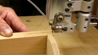
What is Stripping in Interior Design?
Stripping is the process of removing the old surface or finish from a piece of furniture. Whether refinishing a family heirloom or upcycling a thrift store find, stripping wooden furniture is the first step in giving it new life.
What is Stripping made from?
Stripping furniture can be done with several tools and materials such as:
- chemical strippers,
- sanders and heat guns.
Each of these tools has its own advantages and disadvantages, such as the messiness of a chemical stripper or the time required to strip with an electric sander.
While it is possible to do this yourself, you may want to consider hiring a professional furniture restoration expert if you don’t have experience. They can help you choose the best method for removing the old surface or finish, as well as provide advice on how to properly refinish and restore your furniture.
The end result of stripping furniture is a blank canvas ready for staining, painting, or re-upholstering. With the right technique and materials, you will be able to bring your furniture back to its former glory.
Whether you decide to do it yourself or hire a professional, stripping furniture is an important step in restoring and revitalizing wooden furniture pieces. With the right tools and techniques, you can give your old furniture new life!
Strip design wall
Strip design wallpapers can make a room look better. They add color, pattern, and texture to the walls. You can pick one to use for just one wall or pick one that makes the whole room look brighter. There are lots of different designs so you can find something you like.
Types of door weather stripping
Weather stripping is used on doors to make the home more comfortable and use energy. Compression weatherstripping uses a bendy material to seal air out, and door sweeps use bristles to fill in any gaps between the door and frame. Depending on the type of door, either one can be used.
Benefits of weather stripping
- In addition to improving energy efficiency and comfort levels in homes, weatherstripping also helps reduce outside noise from entering the home.
- It can also prevent drafts and keep out pests that may try to come through gaps between doors and frames.
- Finally, weatherstripping helps keep dust and dirt out of the home, which can help protect furniture and other items from getting dirty.
Related Links
San Jose Furniture Stripping – Buck’s Paint
Stripping Furniture: Tips For Refinishing
Related Videos


What is Suede in Interior Design?
Suede is a type of leather that is produced from a fresh split hide, giving it a velvet-like nap. It has been used in interior design for centuries and continues to be popular today. It adds luxury and sophistication to any room and can bring texture into the space.
Suede is the perfect choice for adding comfort, texture, and visual appeal to any room. It can be used in furniture, curtains, wall coverings, and upholstery to create a unique look that will last for years. Whether you’re looking for something classic or modern, suede is sure to add beauty and luxury to your interior design.
What does suede mean in material?
Suede is a type of leather. It has a soft, velvet-like feel. People use it to make shoes and clothing. Suede will make any item look special and luxurious.
What are examples of suede?
Examples of suede include:
- shoes,
- clothing,
- furniture upholstery,
- curtains and wall coverings.
What are the advantages of using suede in interior design?
The advantages of using suede in interior design include:
- it is incredibly durable and will age beautifully with time;
- it can bring added luxury and sophistication to any room;
- it can be used to create a unique look that will last for years;
- it comes in a variety of colors and textures to fit just about any style;
- and with proper care and maintenance, suede can last for years without losing its luxurious appearance.
What does suede look like?
The Suede has a special look and feel. It feels soft like velvet and looks expensive. You can find suede in many colors and styles, from traditional to modern.
What are the 3 characteristics of suede?
The three main characteristics of suede are:
- it is incredibly durable and will age beautifully with time;
- it can bring added luxury and sophistication to any room;
- and it comes in a variety of colors and textures to fit just about any style.
Related Links
Suede
What Is Suede Leather? – Bestleather.Org
What Is Suede, How Is It Made And Differences With Leather – Meridio Band
Related Videos
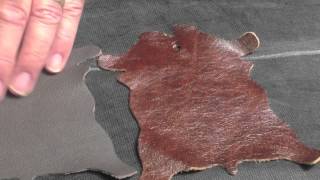
What is a Sussex Chair in Interior Design?
The Sussex Chair is an iconic piece of furniture in interior design, with a look that has been around for centuries. It features an ash frame and rush seat, based on a traditional country design. This timeless style of chair gives any interior space a classic feel, adding both comfort and character to the room. A great addition to any home or office, the Sussex Chair is a perfect choice for those looking to add a touch of vintage charm.
It’s also an excellent choice for those who want to add some rustic charm, thanks to its simple and sturdy design. Whether you’re creating a traditional country-style look or simply adding some timeless appeal to your home, the Sussex Chair can easily fit your design needs. It’s a great option for creating an inviting and cozy atmosphere that’s perfect for both relaxing and entertaining. With its timeless style and simple construction, the Sussex Chair is sure to become a cherished part of your home for many years to come.
When was the Sussex chair designed?
The Sussex Chair is based on a traditional country design that dates back centuries. It was first produced in the late 1700s and has since become a beloved staple of both contemporary and classic interiors. Its simple yet timeless style makes it a popular choice for many different types of spaces, from cozy living rooms to stunning dining rooms. The Sussex Chair is an iconic piece of furniture, and its timeless design will always remain fashionable.
What are the benefits of having a Sussex chair?
The Sussex Chair offers many benefits, both aesthetic and practical. Its simple design makes it easy to fit into any style of the room and adds a touch of charm to almost any interior space. As well as being visually appealing, the Sussex Chair is also incredibly comfortable and provides excellent lumbar support. This makes it a great choice for those looking to add some extra comfort to their home or office space. The sturdy ash frame and rush seat provide superior durability, making it perfect for high-traffic areas such as living rooms and dens. The Sussex Chair is also an excellent choice for those who want to add a touch of rustic charm, thanks to its classic country design. In addition, the Sussex Chair requires minimal maintenance and cleaning, making it a great option for busy households.
Who made the Sussex chair?
The original Sussex Chair was created in the late 1700s by an unknown designer. Since then, it has been produced by a variety of companies, from artisan furniture makers to large-scale manufacturers. It is still a popular choice for those looking for a traditional yet timeless piece of furniture for their home or office. The classic design and quality construction make the Sussex Chair a timeless piece of furniture that will last for many generations to come.
What type of fabric can be used on a Sussex chair?
The traditional rush seat of a Sussex Chair is still one of its most popular features, as it provides superior comfort and durability. However, if you are looking for an alternative material, there are a variety of fabrics available to choose from. Common upholstery fabrics used on the Sussex Chair include linen, cotton, velvet, and leather. Depending on your style preference and the look you are trying to achieve, these different fabrics can give the chair a unique twist while still maintaining its classic country charm.
Why is it called a Morris chair?
The Sussex Chair is sometimes referred to as a Morris Chair due to its similarity in design with an iconic piece of furniture from the Arts and Crafts movement. The original Morris Chair was designed by William Morris, a British designer and artist who was influential in the Arts and Crafts movement. Although it is not an exact replica of the original, the Sussex Chair takes many of its design cues from Morris’ iconic chair, thus earning it the name “Morris Chair”.
Nafisi sussex chair
It is the perfect choice for any home or office. It’s classic design and superior comfort make it a great addition to any space, while its timeless style ensures that it will remain fashionable for many years to come. With its ash frame and rush seat, the Sussex Chair is sure to become a cherished part of your home for many years to come.
Related Links
Sussex Chair – Webb, Philip Speakman – V&A Search The Collections
Arts & Crafts William Morris & Co Sussex Chair – 10169 / La118121 – Loveantiques.com
Museum Of New Zealand Te Papa Tongarewa
The Making Of The Sussex Chair — Nafisi Studio
Related Videos
What is Swag in Interior Design?
Swag is an interior design term for a fabric that’s draped in a looped garland effect or any imitation of the same.
What is Swag used for?
It’s commonly used to decorate windows, doorways, and mirrors. Swags are often seen adorning the tops of curtains, adding softness and texture to any room. They can be used on their own or paired with other treatments such as curtains, sheers, and Valences. Swags provide a warm and inviting look to any room, adding a hint of elegance and sophistication.
Swags are available in different:
- lengths,
- shapes,
- materials,
- colors,
- and patterns; making them perfect for any style of decor from traditional to modern.
Whether you’re looking to add a subtle touch of style or a bold statement piece, swags are the perfect way to enhance any space.
What is a swag room?
A swag room is a space that utilizes the looped garland effect of swags to create a luxurious feel. Swag rooms typically feature walls draped in a fabric pattern, with multiple layers and panels of fabric giving it an upscale appearance. The addition of swags gives the room a cozy atmosphere, creating an inviting and relaxing area for people to enjoy. Swag rooms are often seen in luxury homes, hotels, and resorts, providing a unique and sophisticated look that cannot be achieved with other types of decor.
What is the difference between swag and valance?
Swag and valance are two different types of window treatments.
- Swags are a fabric draped in a looped garland effect or any imitation of the same, while valances are generally more structured pieces of fabric that have a more tailored look.
- Valances can be hung alone or paired with other treatments such as curtains, sheers, and swags. Valances are commonly used to hide hardware and rods, while swags can be used as a standalone treatment or paired with other treatments to create a layered look.
- Swags offer more of an organic feel, while valances provide a more polished and tailored look.
Both types of window treatments are great options for creating the perfect atmosphere in any room.
What is the difference between swags and drapes?
Swags and drapes are both window treatments, but they have some distinct differences. Swags are a fabric draped in a looped garland effect or any imitation of the same, while drapes are generally more structured pieces of fabric that hang straight down from the top of the window. Swags can be used alone to create an elegant and inviting look or can be paired with other treatments such as curtains, sheers, and valances. Drapes are generally more formal looking than swags and are used to provide privacy while adding texture and color to a room.
What is the shape of swag?
Swags come in a variety of shapes and sizes depending on the look you are trying to create. Some swags are teardrop shaped, while others can be more rounded or rectangular. You can also find swags that are asymmetrical, with one side longer than the other. Swags can also vary in length, from a few inches to several feet. When used as a window treatment, swags are usually hung from the top of the window and then draped downward.
Production of swags in interior design
Swags are simple to produce and can be made with any fabric or material. They usually require minimal sewing, making them a great option for DIY projects. If you’re not comfortable sewing, there are companies that specialize in custom swag production, so you can get the perfect look without having to do any of the work yourself.
Related Links
How To Make a Ceiling Swag – Hunker
58 Best Canopy & Fabric Swagging Images – Canopy, Swag, Fabric
Swags – Queen Anne Swag -The Fabric Mill
Drapes & Swags Rentals At Swag Décor – Swag
What is Swan-Neck Handle in Interior Design?
The swan-neck handle is a type of curved handle that was first popular in the 1700s. It has had a resurgence in popularity today as it adds classic elegance to any interior design. The shape of the handle resembles a swan’s neck, which is why it has this name. The smooth curves are pleasing to look at and are a great way to bring a touch of vintage style into any home.
What is Swan-Neck Handle used for?
The handle can be used on furniture, cabinets, and drawers to add an ornate finishing touch. It is often seen in traditional or antique-style homes but can also be used in more modern designs for a unique look. No matter what your decorating style may be, the swan-neck handle is sure to be a beautiful addition. It will add visual interest and tie in with any other details in the room for a truly cohesive look.
No matter what your interior design style may be, the swan-neck handle is an excellent choice that never goes out of style. With its classic shape and elegant curves, it is sure to bring a touch of sophistication to any room. This timeless piece will bring instant charm and make any space look more put together. It will be an eye-catching feature for anyone who enters the room for years to come.
What materials are Swan-Neck Handles made from?
The swan-neck handle can be made from a variety of materials such as:
- wood,
- metal,
- and plastic.
Each material will give the handle a different look, so you have plenty of options to choose from. If you’re looking for something that looks more traditional or antique style, then wooden handles are a great choice.
Advantages of Swan-Neck Handle
- The swan-neck handle is a great way to add sophistication and elegance to any interior design.
- It also has some practical advantages, such as being easy to grip and providing plenty of space for air circulation.
- This makes it ideal for furniture pieces that need to be opened frequently.
Overall, the swan-neck handle is a classic piece of furniture hardware that will never go out of style.
Disadvantages of Swan-Neck Handle
- The swan-neck handle can be quite expensive, especially if you are looking for a more ornate design.
- It is also not as durable as other types of furniture handles, so it may need to be replaced sooner than those made from more sturdy materials.
- Additionally, this type of handle can be difficult to find in stores and may require ordering online.
Related Links
Swan Neck Handles
Swan Neck Drawer Handle
Swan Neck Handle – C38 : Optimum Brasses
Vintage Hardware & Lighting – Swan Neck Bail Handle 5″ Cc (B-8F)
What is a Swing Leg in Interior Design?
A swing leg is an interior design feature that can greatly expand the functionality of a room. It consists of a table leg, usually hinged, which swivels outwards to support a drop leaf or other surface. This allows for easy expansion and contraction as needed, offering maximum flexibility in terms of available space.
What is a Swing Leg used for?
Swing legs are often incorporated into larger dining tables, allowing for more seating capacity when necessary; they can also be used with small end tables or coffee tables to provide additional surface area. Swing legs are a great way to make the most of limited space and can give any room a unique look and feel.
In terms of construction, swing legs are typically made from solid wood for strength and stability, although metal or plastic frames can also be used. The legs must be fitted with strong hinges that are capable of supporting the weight of the tabletop when extended. For added convenience, some models come with folding mechanisms to allow for easy storage when not in use. With a little bit of care and maintenance, swing legs can provide years of reliable service.
Overall, swing legs are an excellent way to optimize the space available in any interior design project. They offer a great solution for accommodating extra guests or providing additional surface area when needed, while also bringing a stylish and unique look to the room. With a variety of materials and sizes available, there is sure to be a swing leg that fits your needs.
What is the difference between a gateleg table and a drop-leaf table?
- A gateleg table is a type of drop-leaf table that has two hinged leaves on either side. When the leaves are folded down, the “gate” is formed and it takes up much less space than a full-sized drop-leaf table.
- A drop-leaf table only has one leaf which can be dropped down to save space when not in use.
- Both tables are great space savers, but the gateleg table offers more flexibility and can generally accommodate more people than a drop-leaf table.
What are the characteristics of a gateleg table?
- Gateleg tables are typically made of wood and feature two hinged leaves that can be folded up or down.
- When the leaves are closed, they create a gate-like shape that takes up much less space than a full-sized table.
- Gateleg tables also have extra support legs to ensure stability when the leaf is extended.
- These tables are generally more compact than drop-leaf tables, making them ideal for smaller spaces.
- Additionally, gateleg tables are perfect for accommodating extra guests as they can be easily expanded or contracted to fit the situation.
Related Links
Gateleg Table
Swing-Leg Table – Woodworking Project – Woodsmith Plans
Vintage Brandt Swing Leg Drop Leaf Scalloped Mahogany Dining Table
Related Videos

What is a Swivel Chair in Interior Design?
A swivel chair is a type of furniture typically used in interior design. It consists of a seat that can rotate on its base, allowing the user to pivot 360 degrees with ease. Swivel chairs are often seen in home and office settings, primarily for convenience and comfort. They come in various styles such as executive desk chairs or lounge chairs, allowing the user to choose a chair that is most appropriate for their space.
What is a swivel chair used for?
Swivel chairs are also commonly used in dining rooms and kitchens, as they provide mobility while allowing the user to remain seated. In addition, swivel chairs are often adjustable in terms of height and tilt/recline, making them suitable for any type of user. Swivel chairs are an excellent choice for any interior design, as they can add functionality and comfort to a room.
What is the swivel chair process?
- When choosing a swivel chair, the first step is to determine what type of chair is best for the user’s needs.
- Once this has been established, it’s important to measure the space available in order to choose a chair that fits within the desired dimensions.
- Finally, consider any additional features such as adjustable height or tilt/recline that may be required.
With these considerations in mind, selecting a swivel chair that is both suitable and comfortable should be easy.
Related Links
Swivel Chairs
Swivel Accent Chair
Swivel Chair Definition And Meaning – Collins English Dictionary
How To Decorate With Swivel Chairs